150 Amazing Restaurant Website Design Examples
You may think that your restaurant shopfront solely lies at your restaurant front door, but this is not always the case according to a recent survey by Open Table, a whopping 86% of customers had taken to the web to appraise a restaurants menu prior to visiting.
A great website is like that perfect dish that you have lovingly prepared and like that dish, there are many ingredients that go a long way to making sure your restaurants website is truly the crème de la crème.
So, what are the most important things that your potential customers are looking for when it comes to deciding what restaurant to go to?
We outline the top website examples that you can use as inspiration to showcase your own restaurant whilst providing that all-important information to help influence potential customers to book a table.
150 Of The Best Restaurant Website Design Examples
1. Caravan Exmouth Market
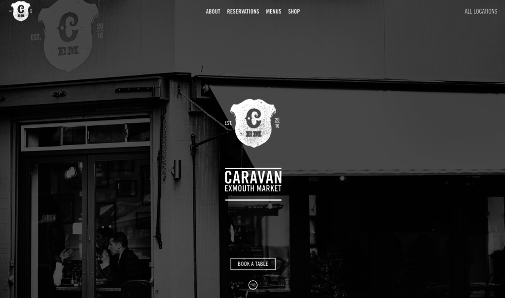 Why we love it: It’s a clean and classic design where you can access information within just one click.
2. Parts & Labour
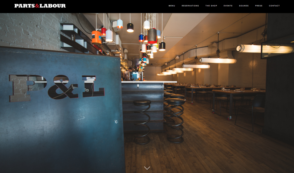
Why we love it: Its excellent use of full-width images that showcase the restaurant and its food.
3. Marie Catribs
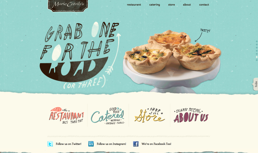 Why we love it: For its stylish and unique typography which makes this site standout.
4. Patria Toronto
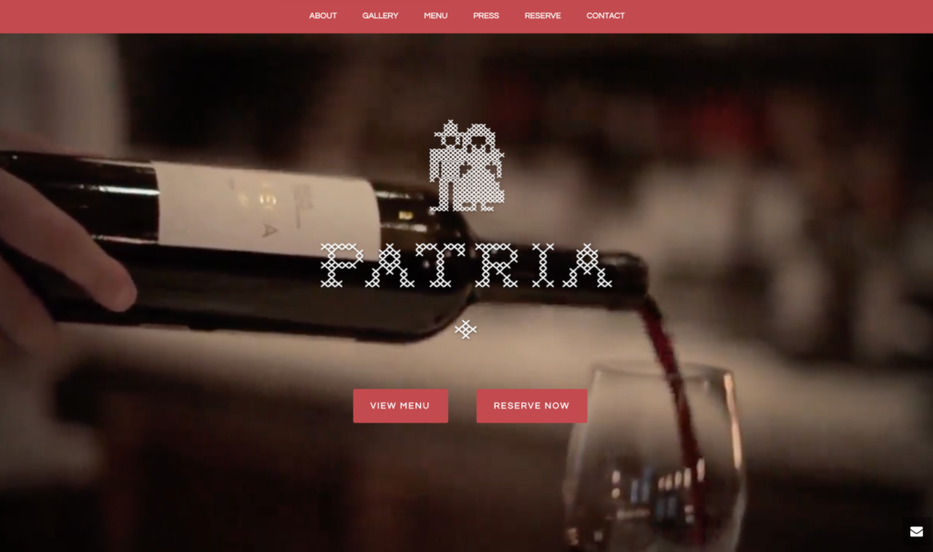
Why we love it: For its strong calls to action (Reserve Now)
5. Mei Mei Boston
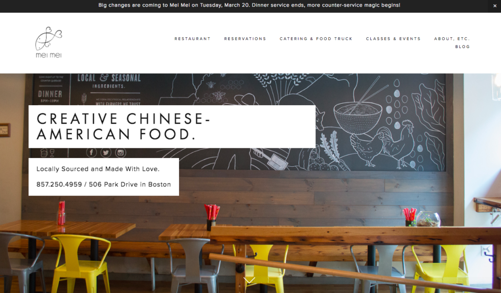
Why we love it: For its informative content – from their food truck to their blog posts
6. Marlowe SF
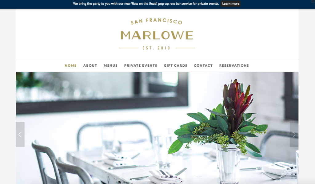
Why we love it: Fantastic imagery and that the restaurant awards are prominently displayed
7. Susie Cakes
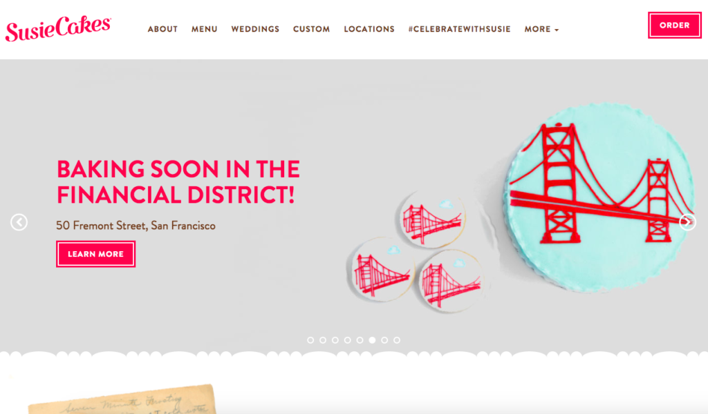
Why we love it: For its easy-to-use menu and that it is mobile friendly
8. Brewsters
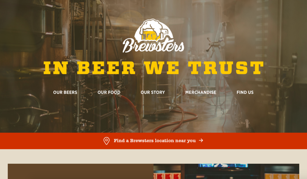
Why we love it: For its bold and vibrant design
9. Restaurant Benedicts
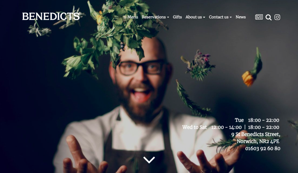
Why we love it: It represents chef-owner Richard Bainbridge’s brand and personality effortlessly
10. Dutch’s Portland
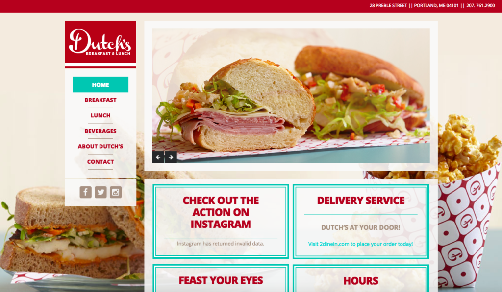
Why we love it: For the elegant embed of its Instagram feed
11. Bliss and Vinegar
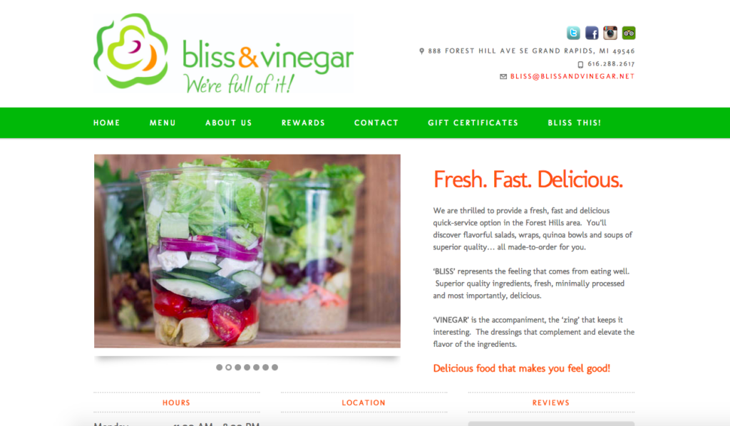
Why we love it: It promotes their reward scheme and gift certificates
12. Costa Vida
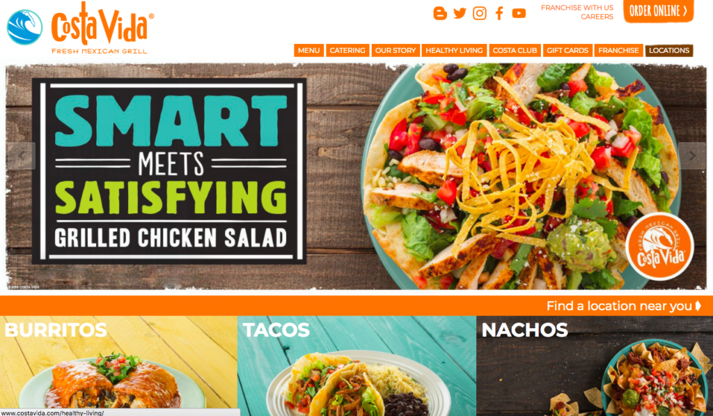
Why we love it: For its handy ‘find my location’ feature
13. Smokey Bones
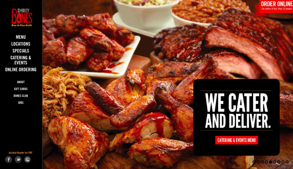
Why we love it: For its evocative imagery
14. Cragie On Main
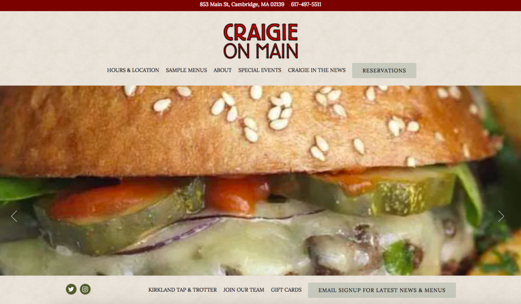
Why we love it: its contact details are front and centre, making it easy to get in touch
15. Sugar Mill
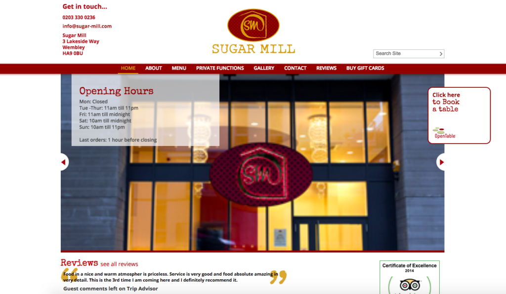
Why we love it: Its use of a carousel of handy slides on the homepage
16. City Tap Penn Quarter
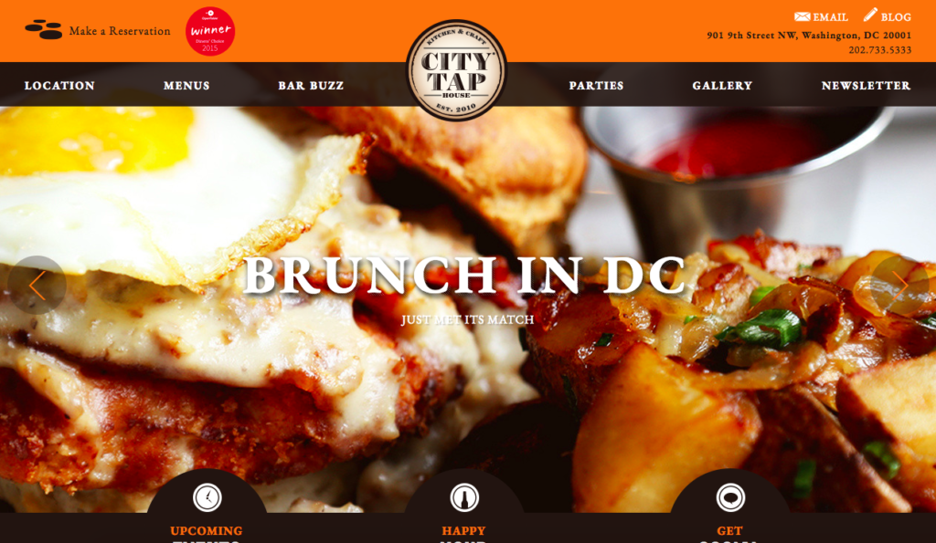
Why we love it: It easily identifies its USP’s which hits the visitor upon entering the website
17. Jack’s Bar London
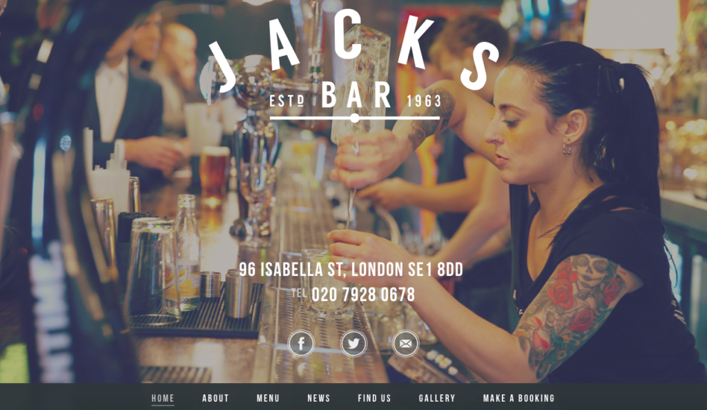
Why we love it: It immediately sets the tone and gives the visitor an idea of the brand identity.
18. Pho Cafe
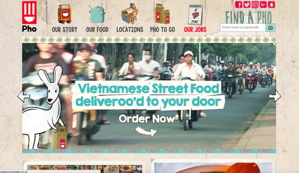
Why we love it: For its colour and lively design
19. Pause Cat Cafe
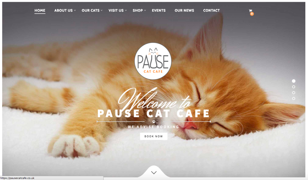
Why we love it: How it showcases its unique selling points and its evocative imagery
20. Banque & Bohem
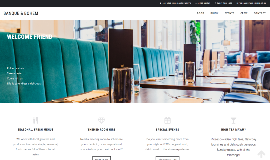
Why we love it: For its stylish imagery in the gallery
21. Chicago Bagel Authority
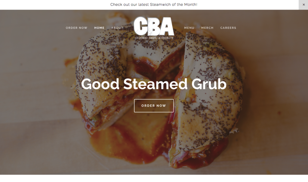
Why we love it: Clean and contemporary design
22. Upper Crust Pizzeria
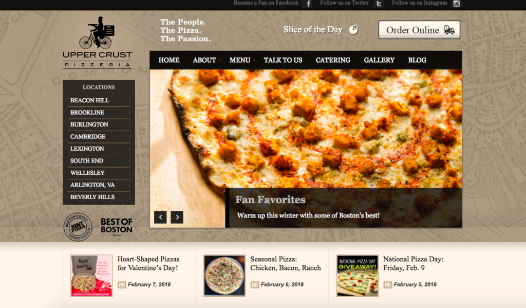
Why we love it: You can access your desired locations with ease and order online effortlessly
23. Bob’s Steak & Chop House
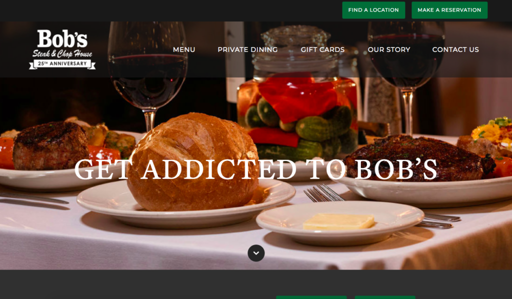
Why we love it: For its strong calls-to-action- you can easily make a reservation from one click of a button
24. One Market
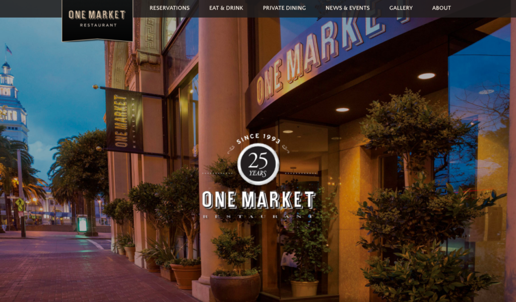
Why we love it: It utilises stunning photography, both restaurant and the food
25. Southern Belly BBQ
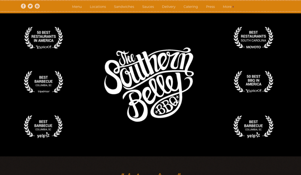
Why we love it: the way it shouts about its impressive array of awards
26. Maialino
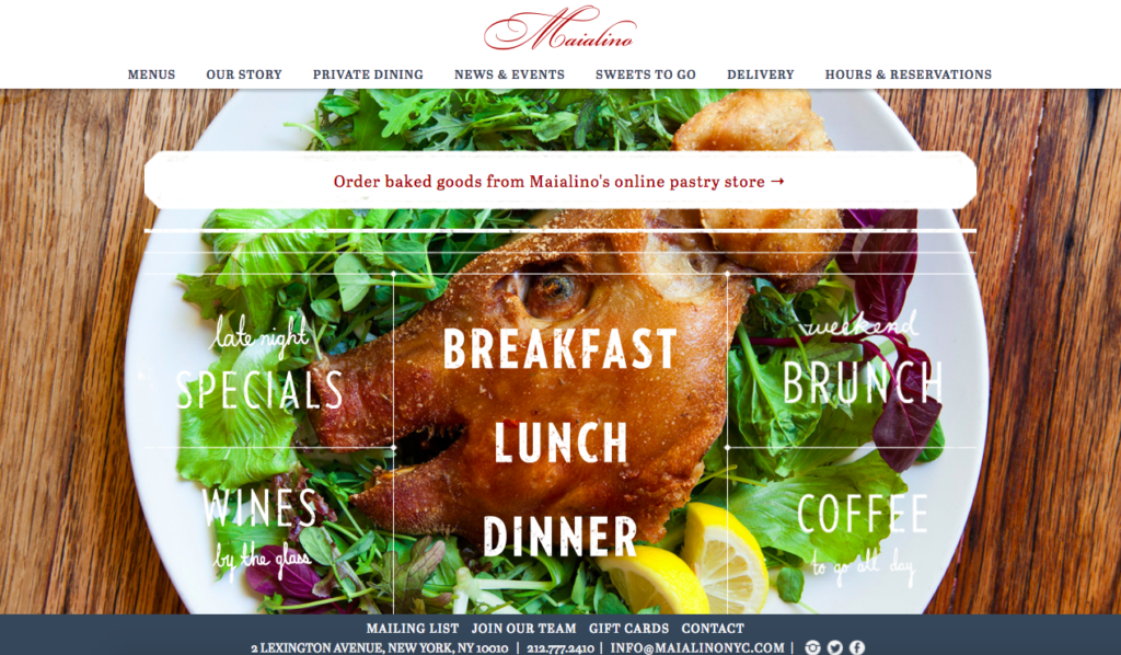
Why we love it: For integrating its menus into the homepage graphic
27. Desert Chill
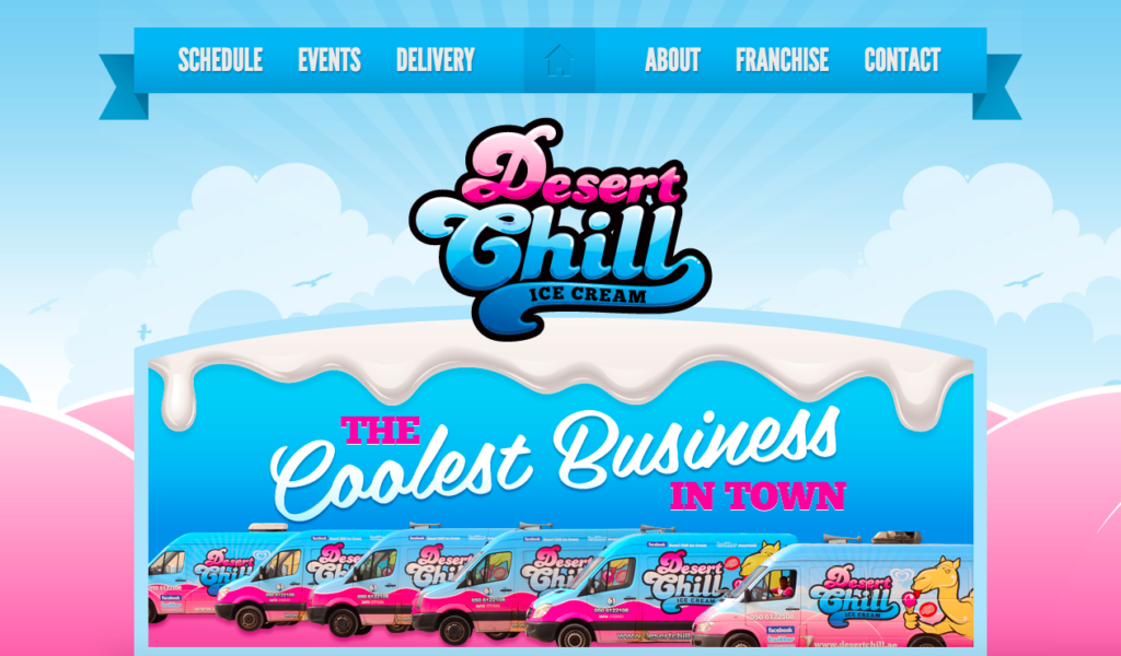
Why we love it: For its cool and fun design that really represents the brand
28. Brawn
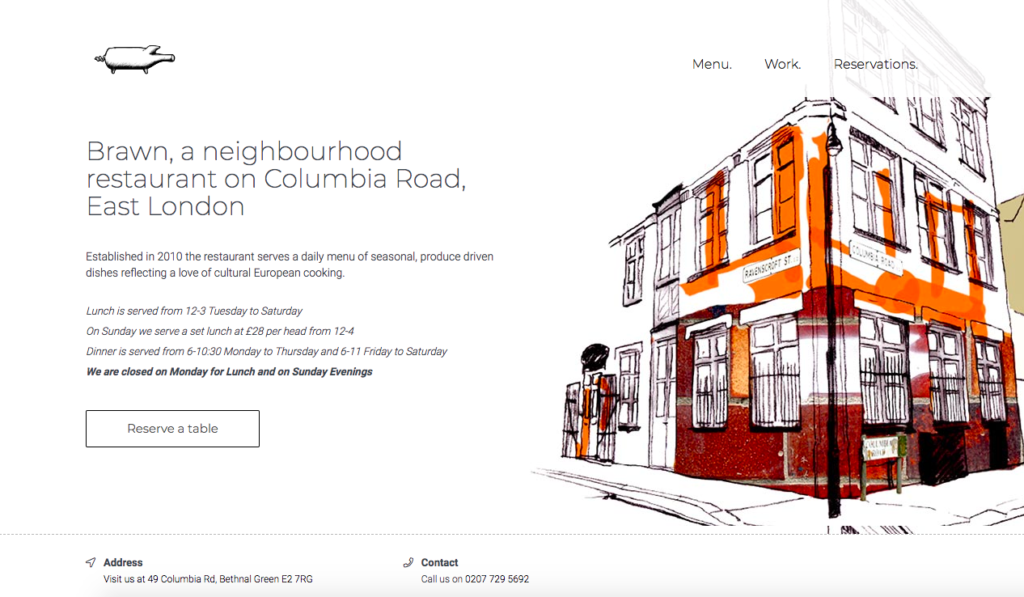
Why we love it: Its use of great line drawings
29. Toni Patisserie
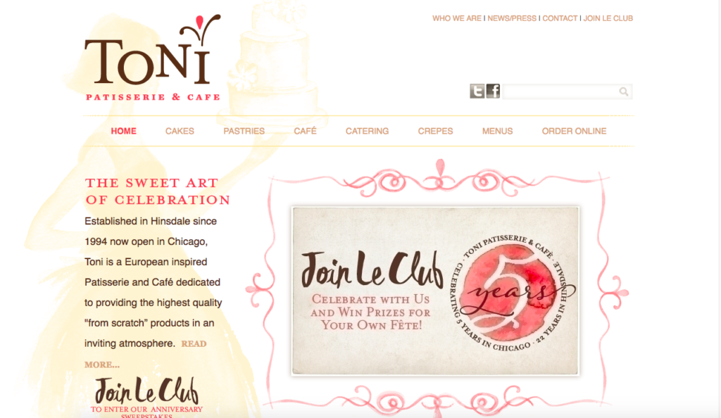
Why we love it: The way it encourages data capture
30. Salty Sow
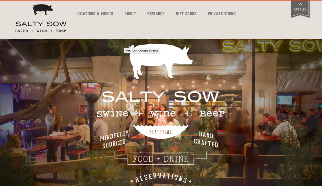
Why we love it: Its fun typography and styling
31. Gramercy Tavern
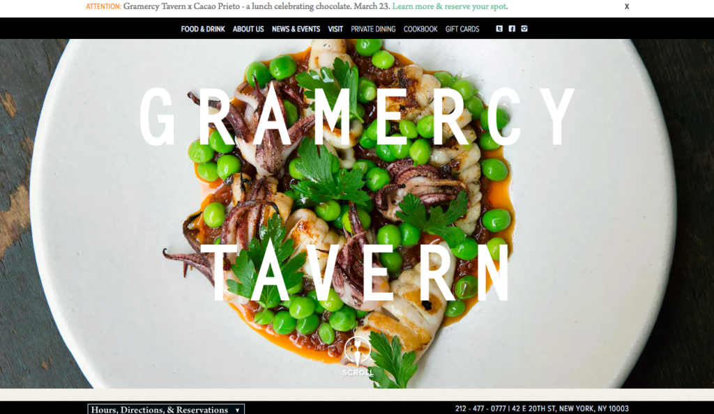
Why we love it: For its style and its ease for making a reservation
32. Black Sheep Pizza
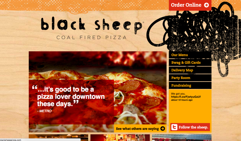
Why we love it: For the way it highlights its press reviews on the homepage
33. Frita Batidos
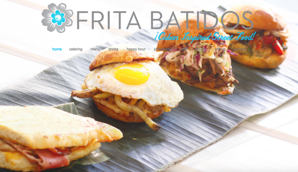
Why we love it: For its soft use of colour and friendly design
34. Blue Oak BBQ
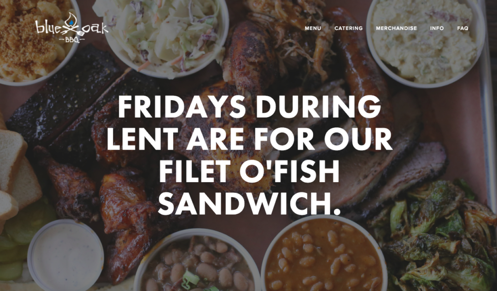
Why we love it: It utilises a full-width screen
35. Butchers’ Bistro
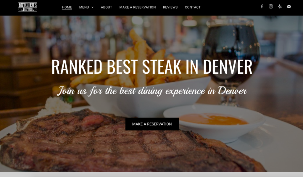
Why we love it: The homepage hits you with a reservation button and it really sets the tone of what the diner can expect
36. The Pig Hotel
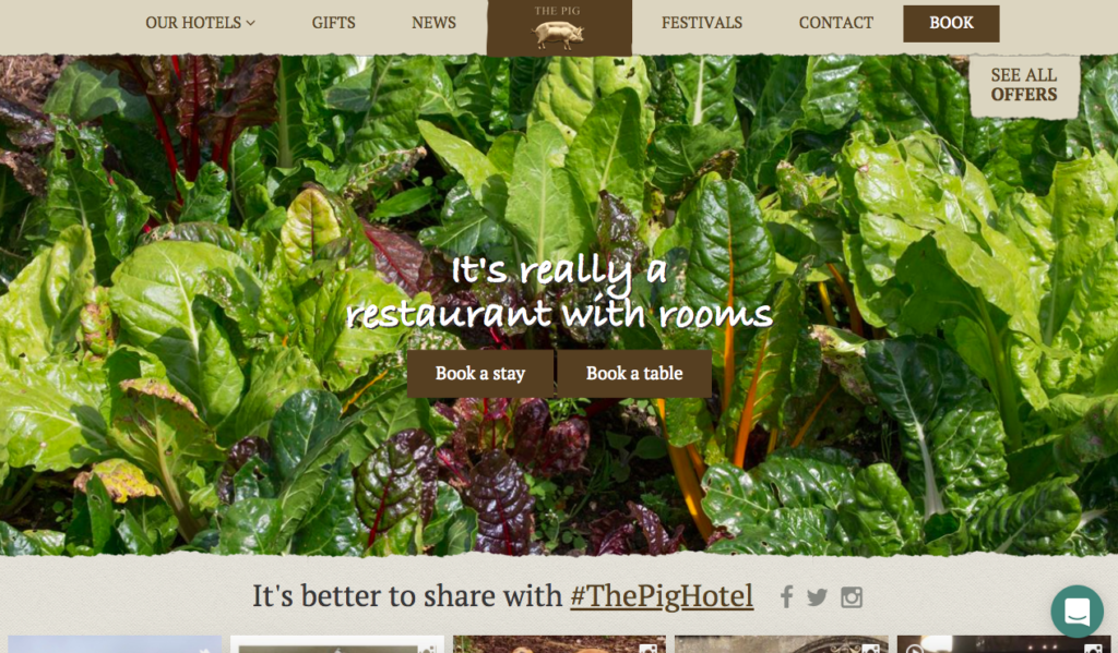
Why we love it: It showcases the beautiful views of where the hotel/restaurant is located, and you can easily navigate between their various locations
37. The Saint Austere
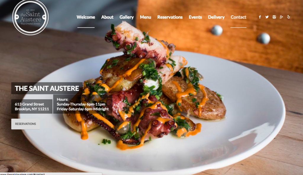
Why we love it: For its stunning food imagery
38. The Nugget Spot
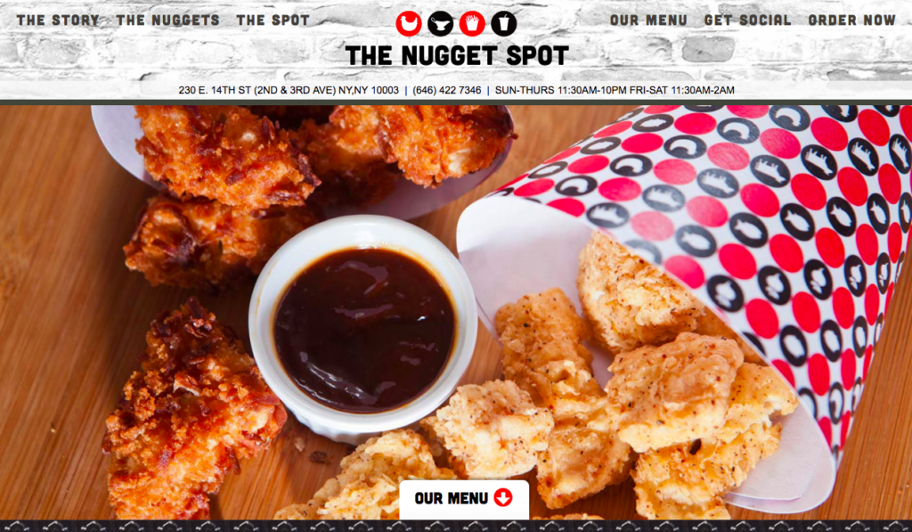
Why we love it: the menu easily identifies what dishes are suitable for people with specific dietary requirements.
39. Fuji At Kendall
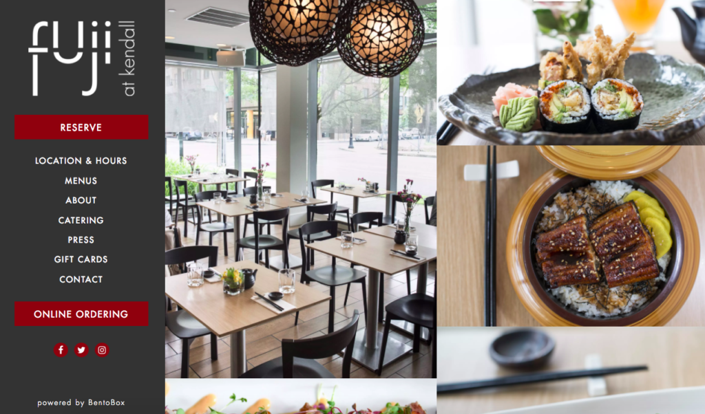
Why we love it: It’s quirky side menu which highlights how you an order online
40. Tasty n Alder
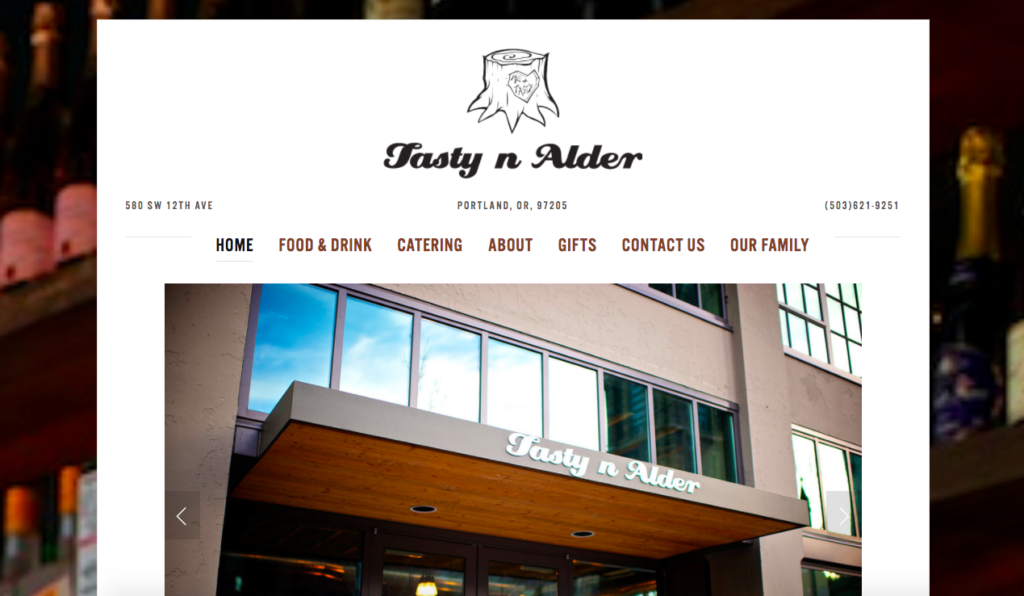
Why we love it: It’s stylish and eye-catching logo
41. True Food Kitchen
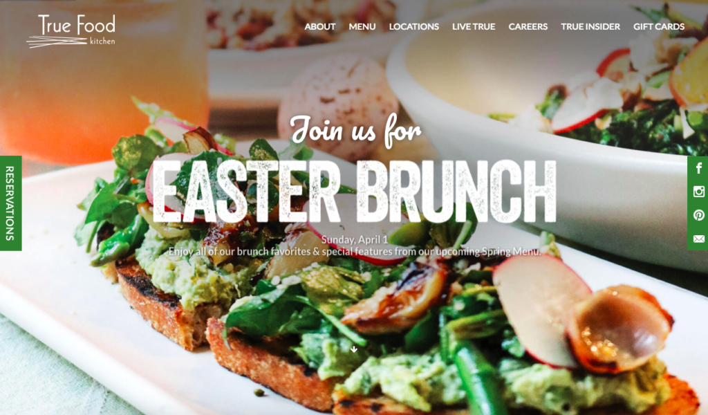
Why we love it: It ‘does exactly what is says on the tin’ and has a strong brand identity
42. Butcher and the Rye
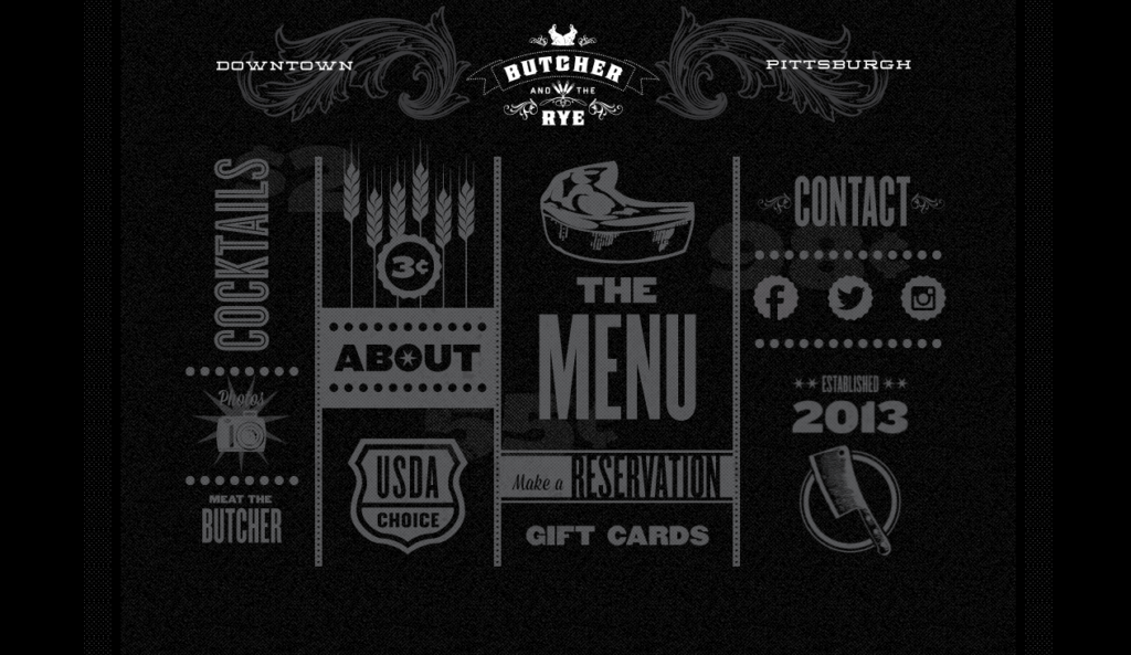
Why we love it: For its simple but effective navigation
43. Brasil Arts Cafe
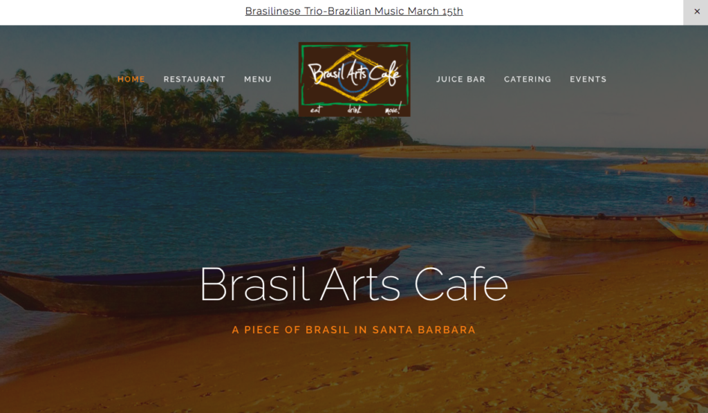
Why we love it: Its striking imagery and evocative copy
44. Mani Osteria
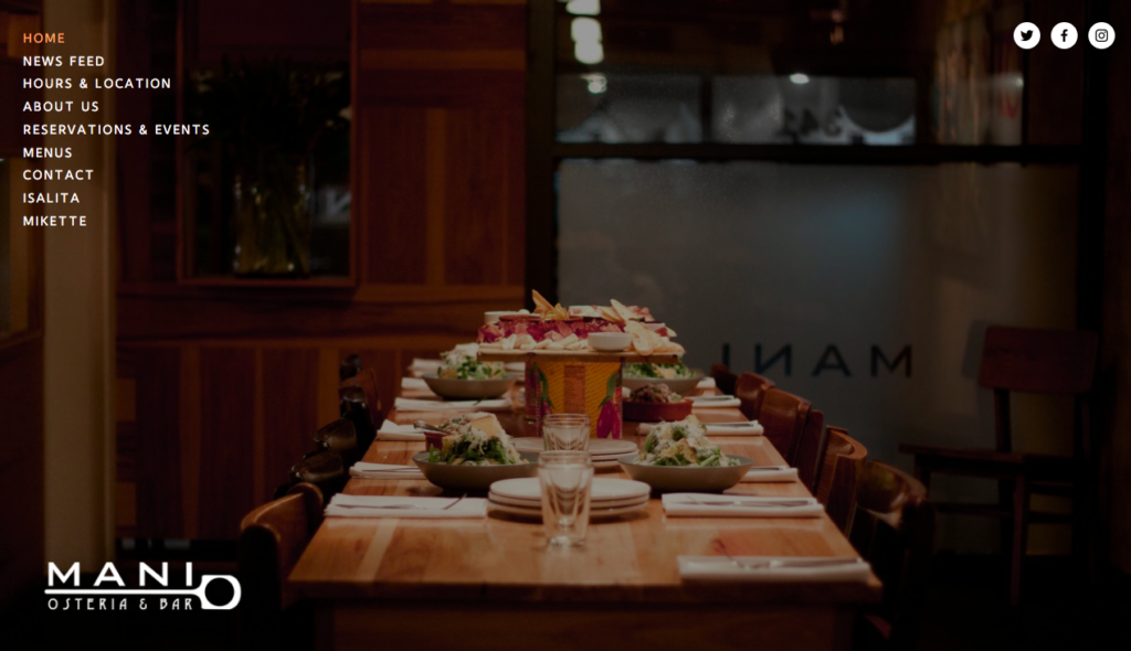
Why we love it: How it outlines its opening hours at a glance
45. Rosella Coffee
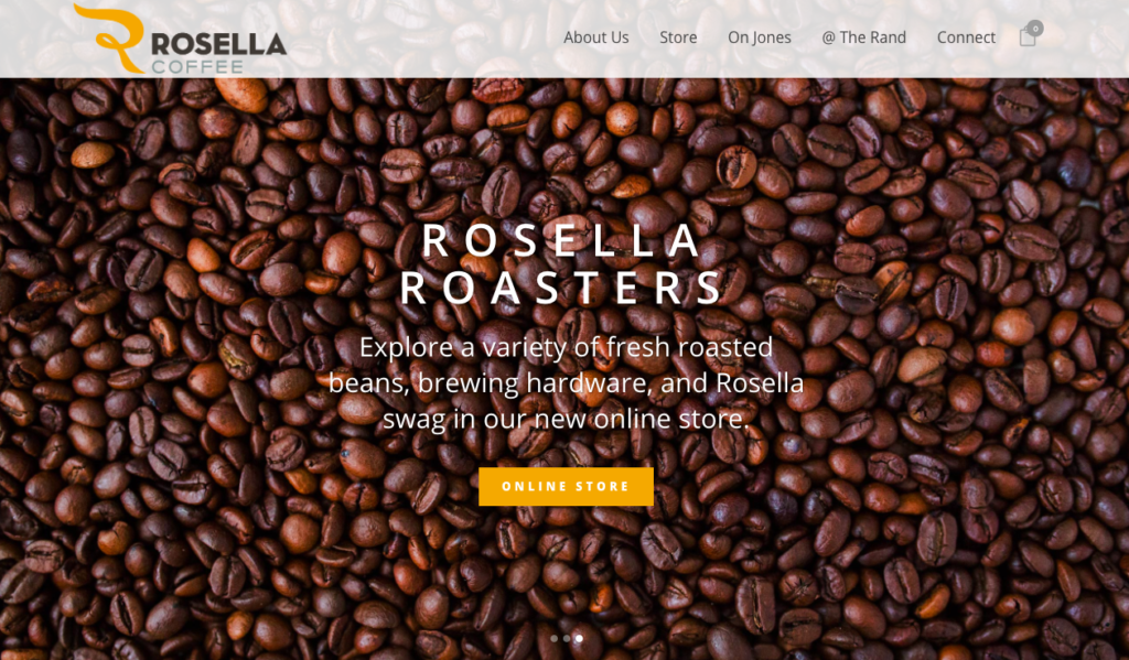
Why we love it: For its skilful use of imagery
46. Some Random Bar
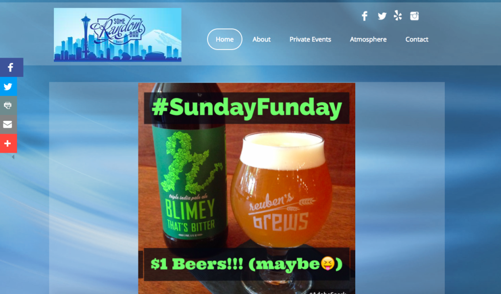
Why we love it: For its fun and quirky design
47. The High Tower
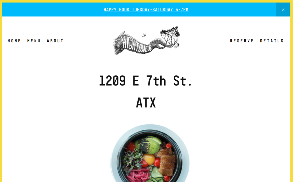
Why we love it: How it highlights ‘happy hour’, its standout logo and how it’s not afraid to use ‘white space’.
48. Jolly Pumpkin
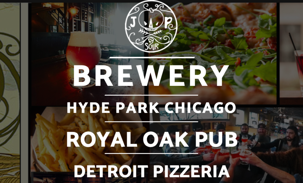
Why we love it: How you can easily navigate from each of the restaurants from the focused landing page
49. Bistro Zola
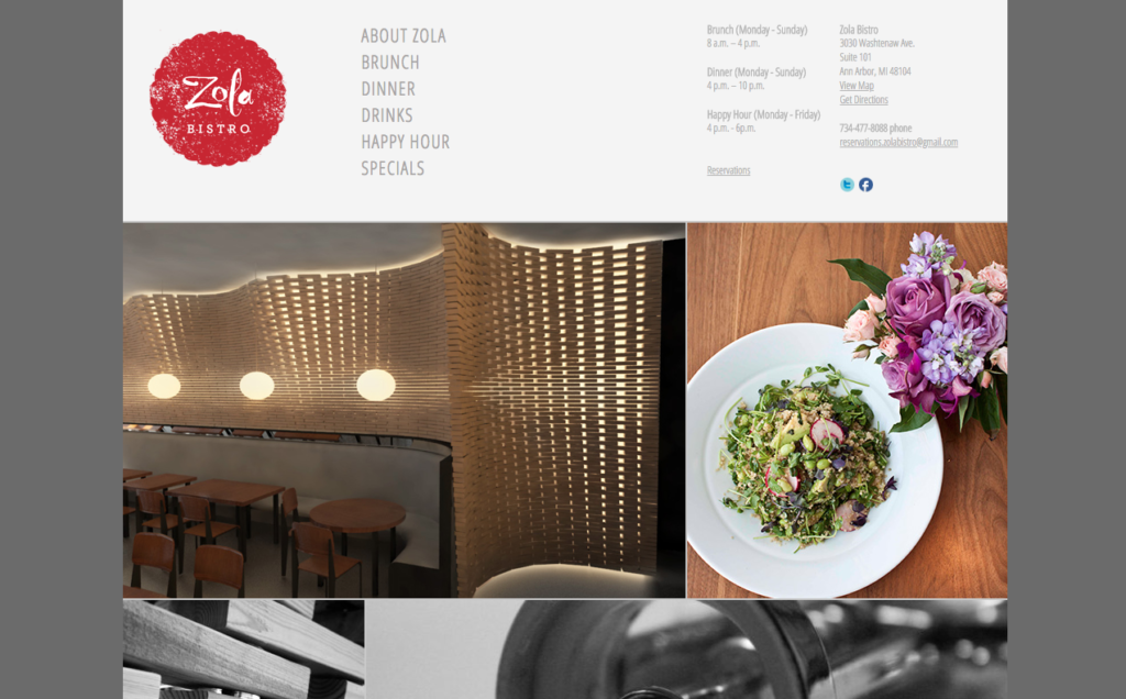
Why we love it: For its clean layout and wonderful use of imagery
50. Isabel’s Restaurant
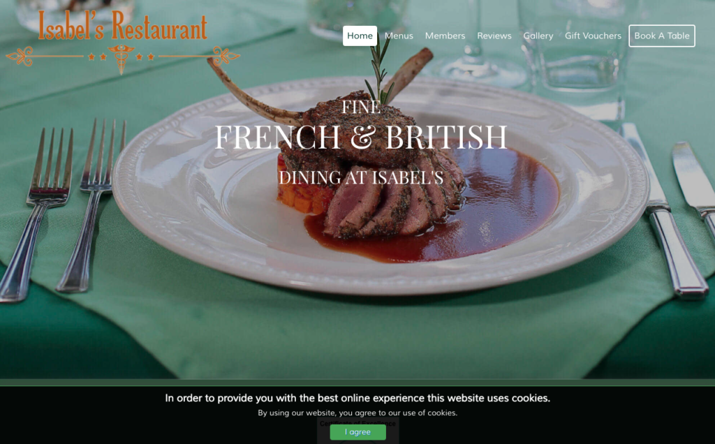
Why we love it: For its stylish use of photography
51. The Gnarly Barley
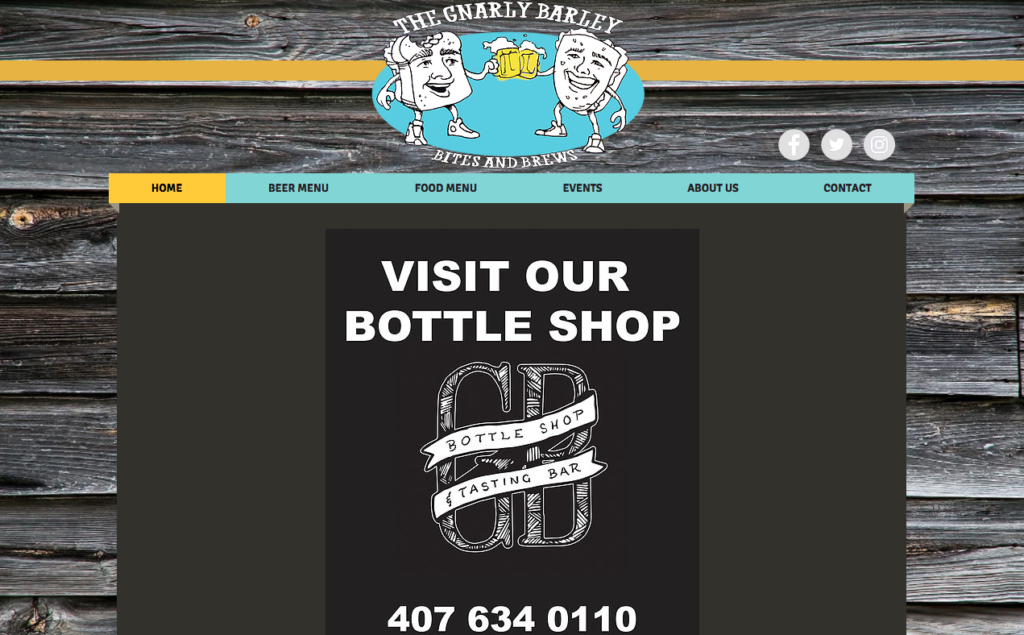
Why we love it: How easy it is to access the information that you want
52. Oleana Restaurant
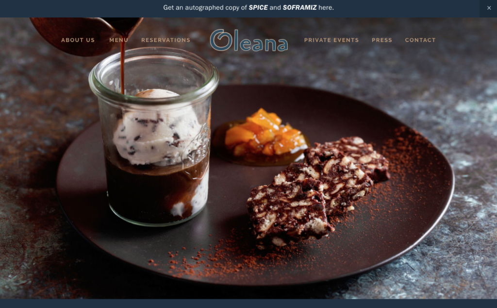
Why we love it: For its simple but stylish navigation
53. Doc Fords
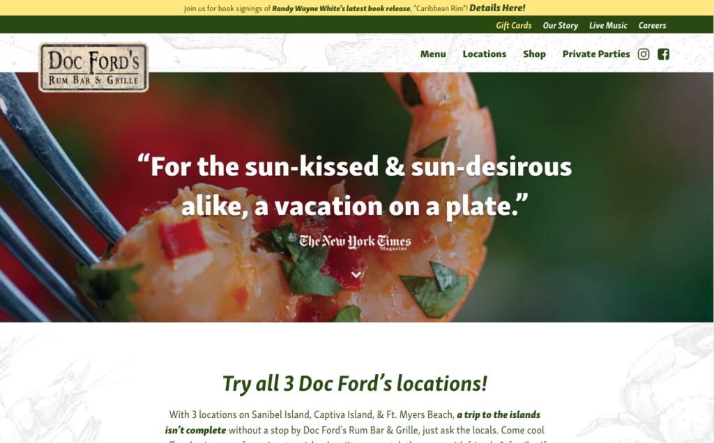
Why we love it: The slogan and the social proof on its front page
54. Up Dog
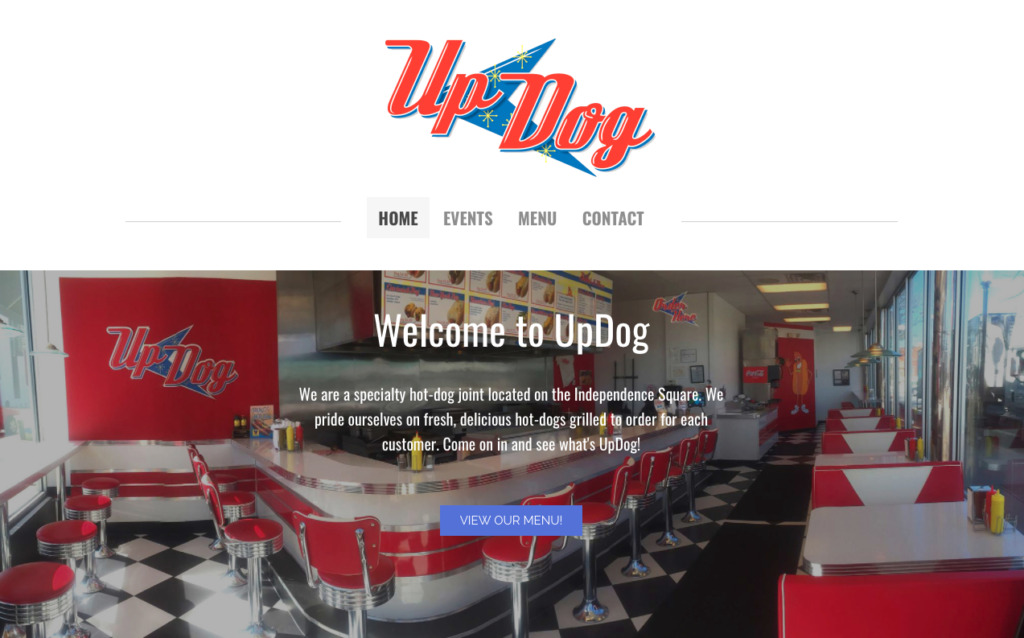
Why we love it: For its solid use of colour and imagery
55. Blue Collar Miami
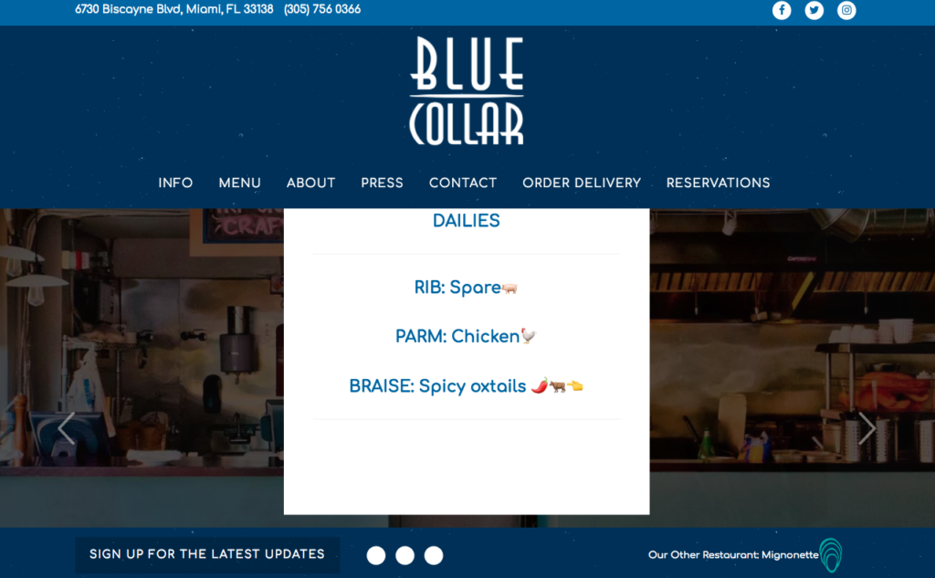
Why we love it: For how it highlights its daily specials
56. Jimmy’z Kitchen
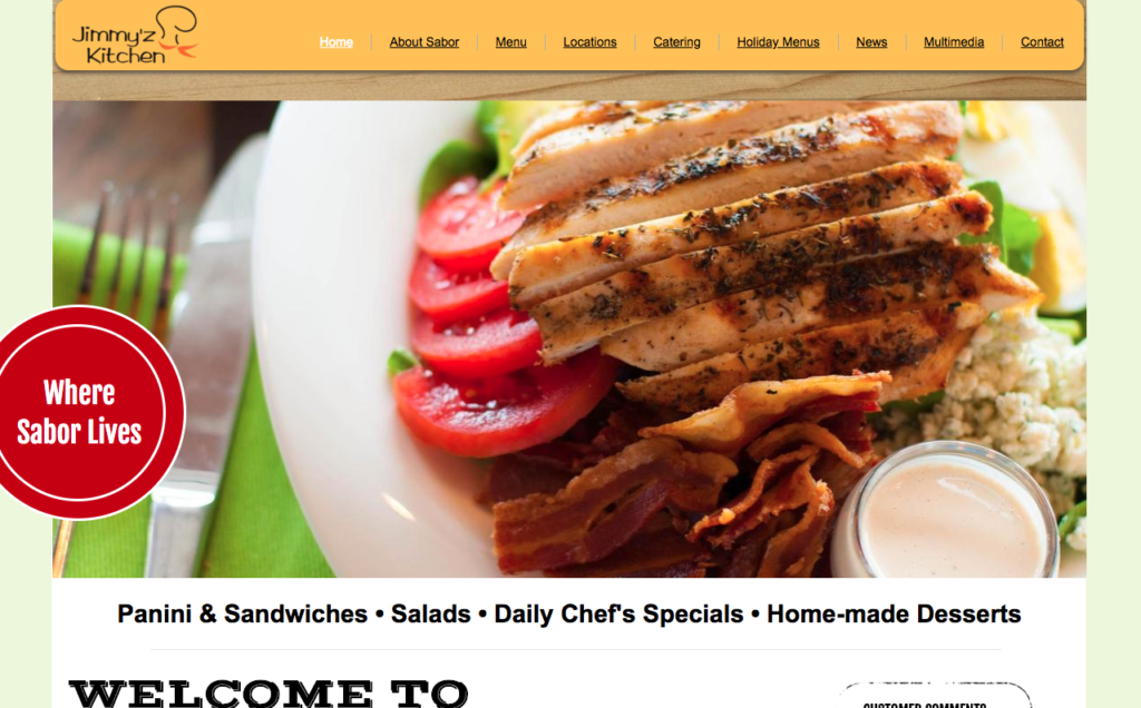
Why we love it: This sites strength is that it really makes use of video which is great for engaging content
57. Proper Pittsburgh
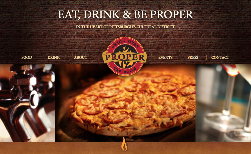
Why we love it: For its daring use of a menu navigation in the middle of the website page
58. Thip Khao
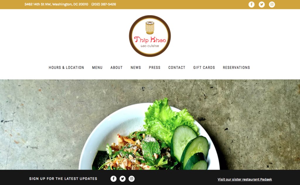
Why we love it: For its rich colours and effective content
59. La Ventana
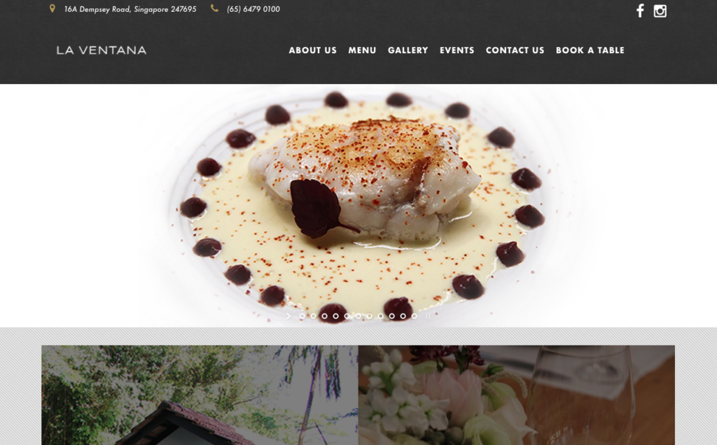
Why we love it: For its clean and stylish layout
60. Stormfish
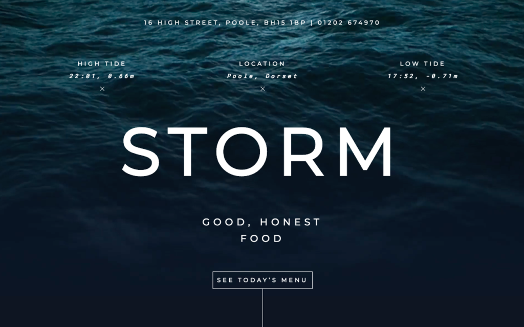
Why we love it: The gorgeous ripple effect of the sea in the background
61. Mission Juice
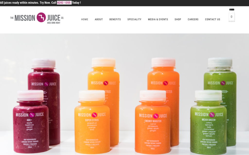
Why we love it: Love the clean, clear image presented
62. Bar Isabel
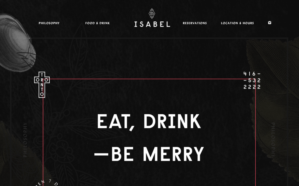
Why we love it: For its quirky design elements like the latlong coordinates on the homepage
63. Earls
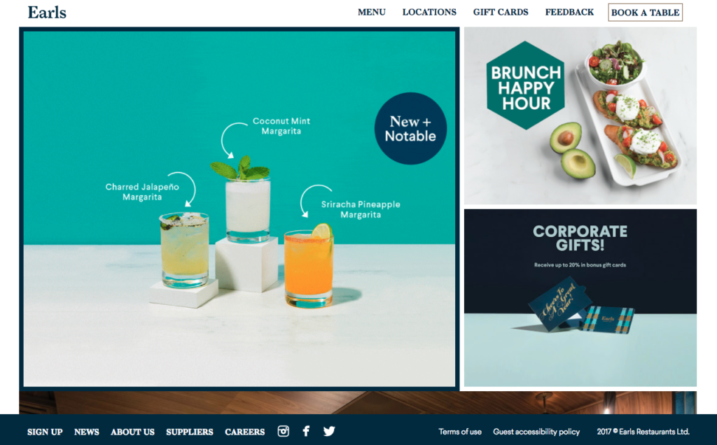
Why we love it: For its stunning contemporary design and focus on striking imagery
64. Amsterdam Beer
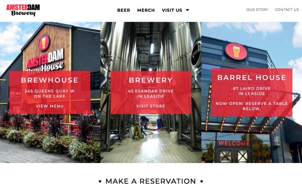
Why we love it: Not only is it a beautifully designed and visually appealing website but it has a strong information architecture too
65. Elcatrin
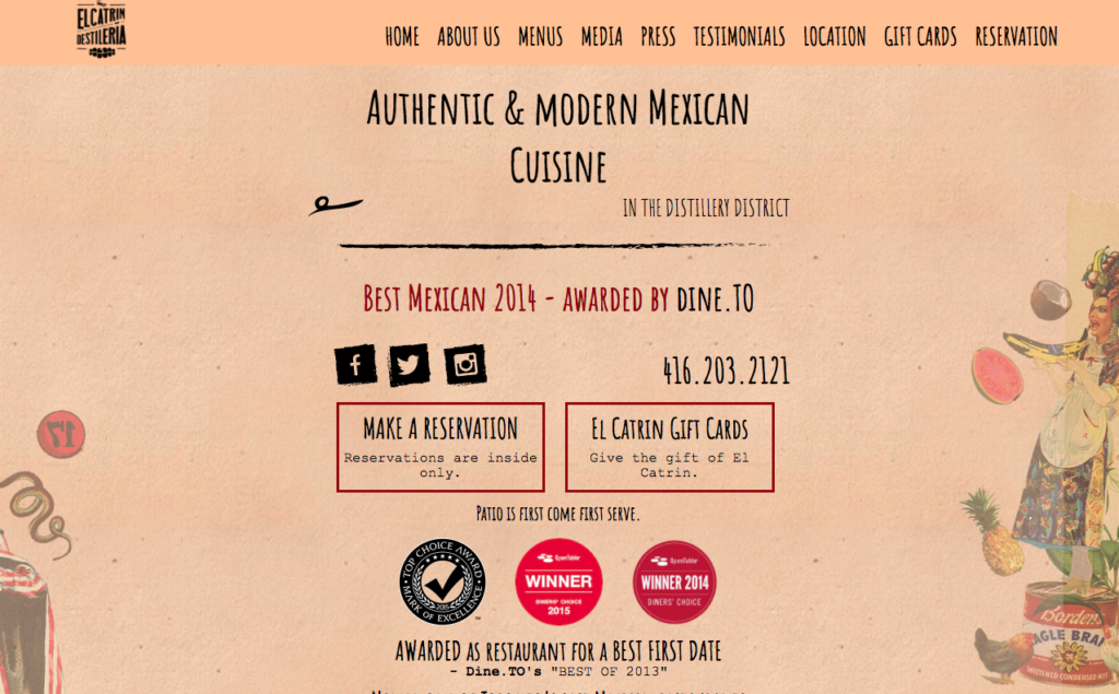
Why we love it: Its stylishly authentic and you can access the information you need really easily
66. Le Bernardin
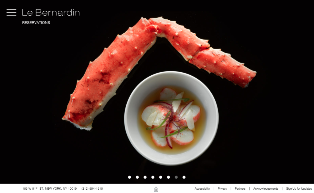
Why we love it: It’s unusual side menu and its use of compelling imagery
67. La Pierre Qui Tourne
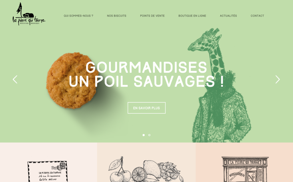
Why we love it: It’s unique use of line drawings add a sense of charm to this stylish website
68. Pure Thai Cookhouse
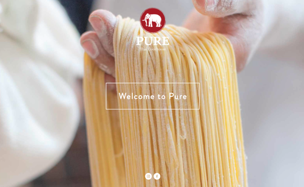
Why we love it: For its easy layout and colourfully rich imagery
69. Girl and the Goat
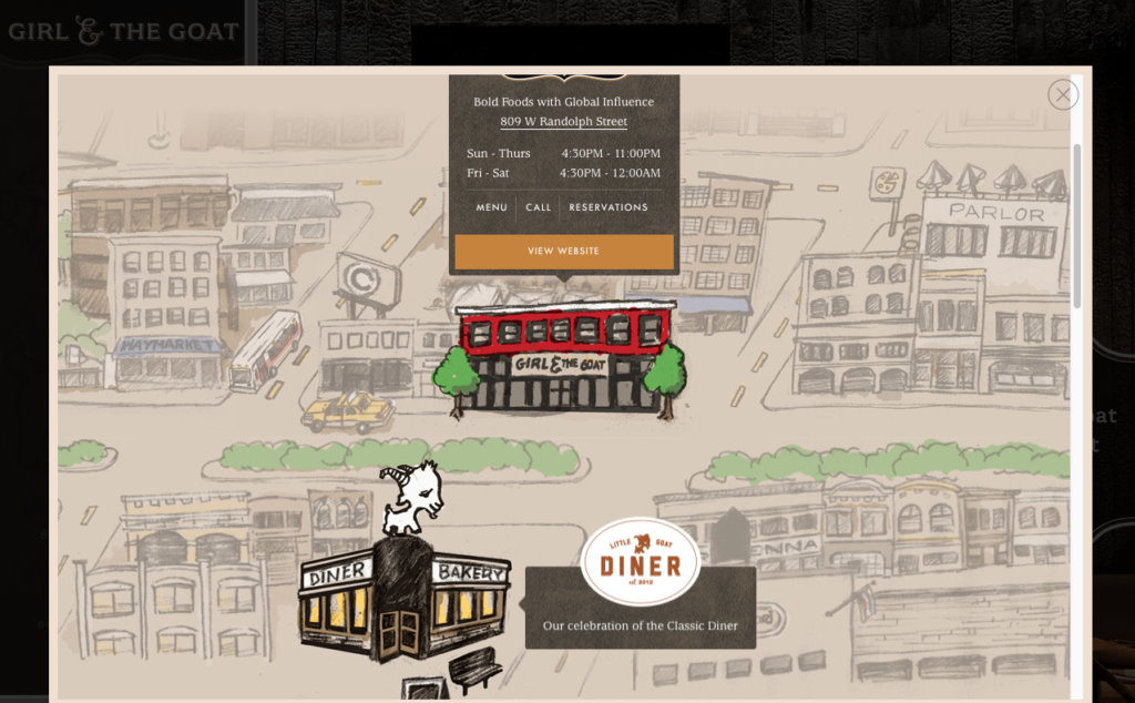
Why we love it: For its excellent fusion of strong visuals and helpful content
70. Sarcoa
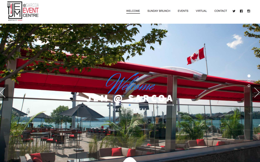
Why we love it: It’s a simple, yet effective website that utilises great typography.
71. Porte Sainte Claire
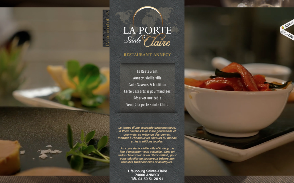
Why we love it: For its great use of moving imagery
72. Famous Cookies
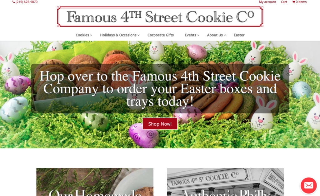
Why we love it: The way it showcases its assorted products
73. Nunsongyee
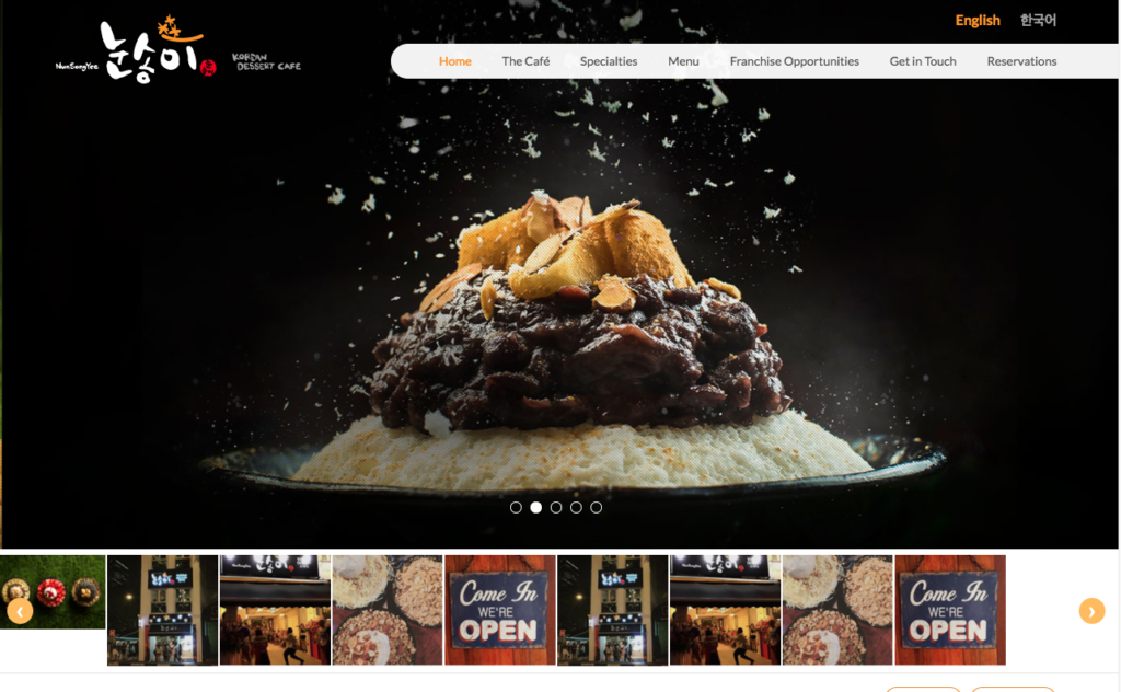
Why we love it: It showcases its food products well.
(NOTE: Nunsongyee uses CandyBar to run its loyalty program!)
74. Megumi
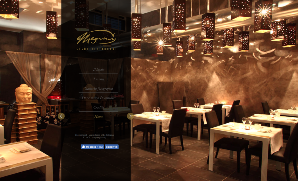
Why we love it: For proving that websites don’t always need to have a white and clean background
75. Solegiallo
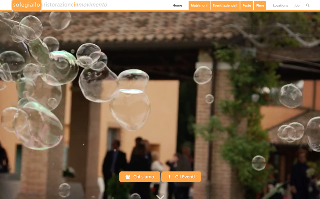
Why we love it: for its use of striking imagery and evocative music
76. The Eddy
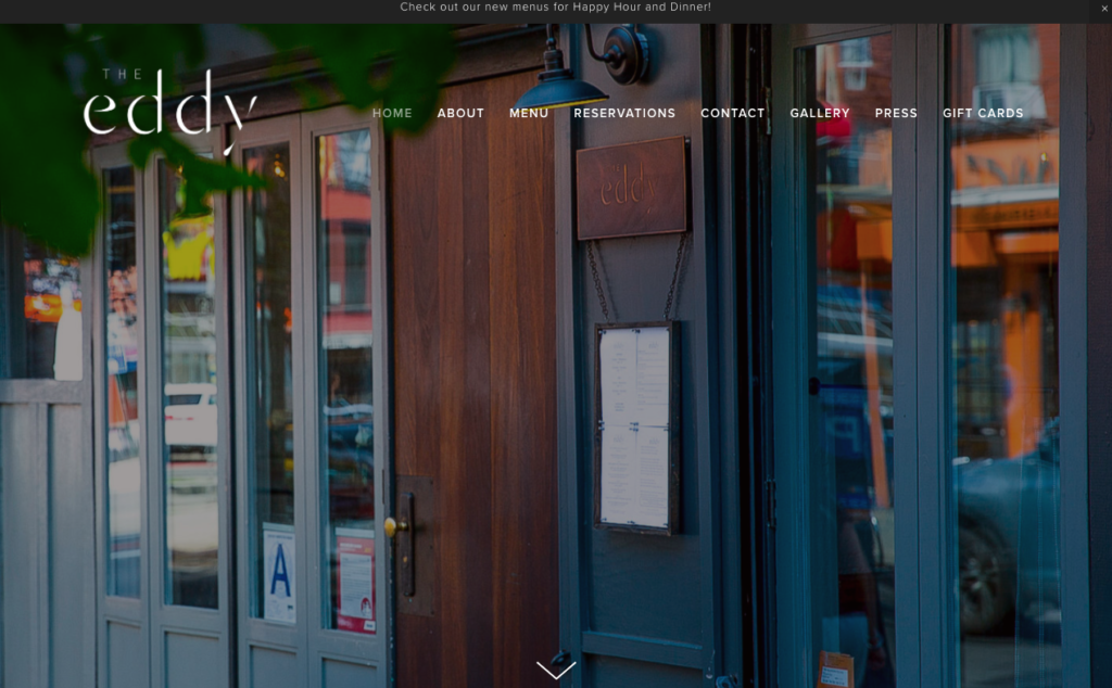
Why we love it: It has a simple but effective design and provides a great insight into the restaurant team
77. Artifact Coffee
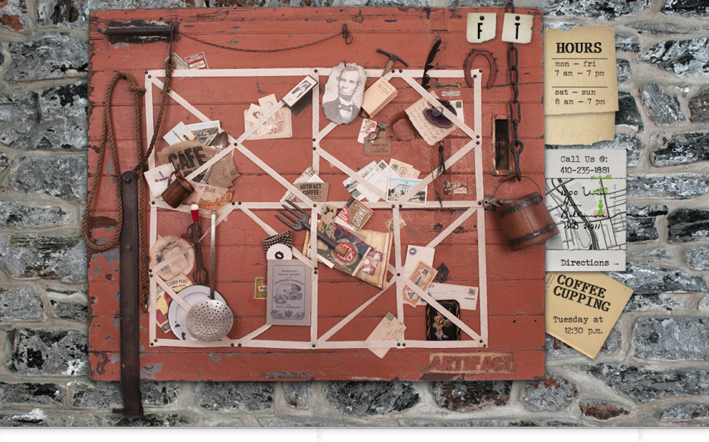
Why we love it: It is super stylish with cute features such as the postcard and the memo board
78. Brass Union
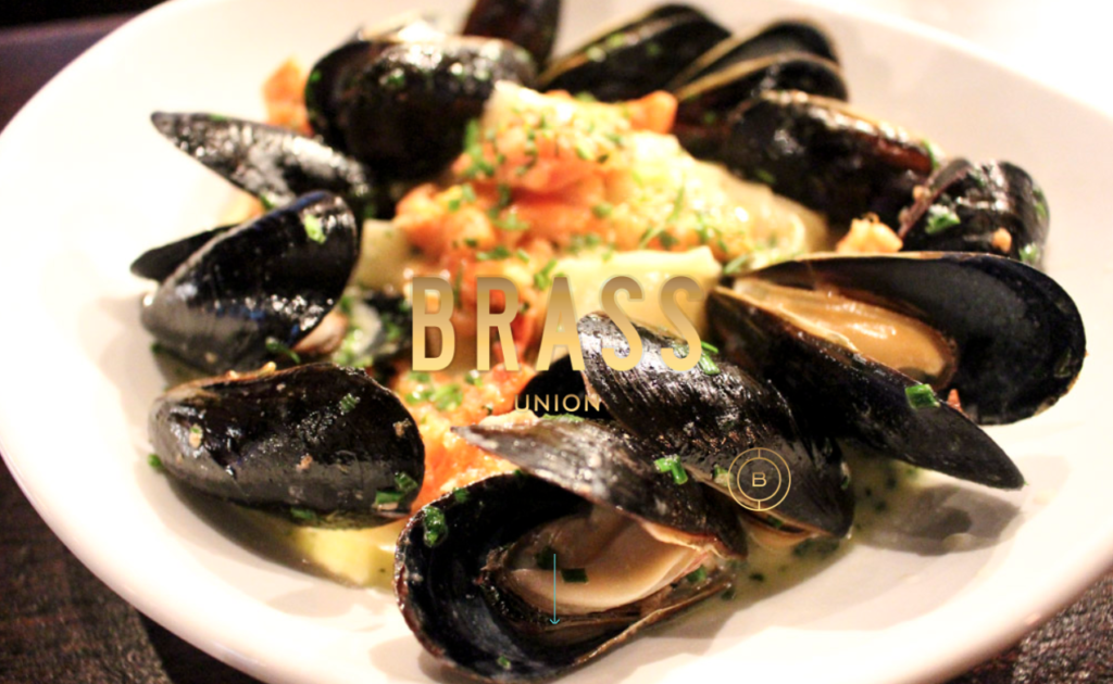
Why we love it: For it’s fantastic use of imagery
79. Restaurant Roots
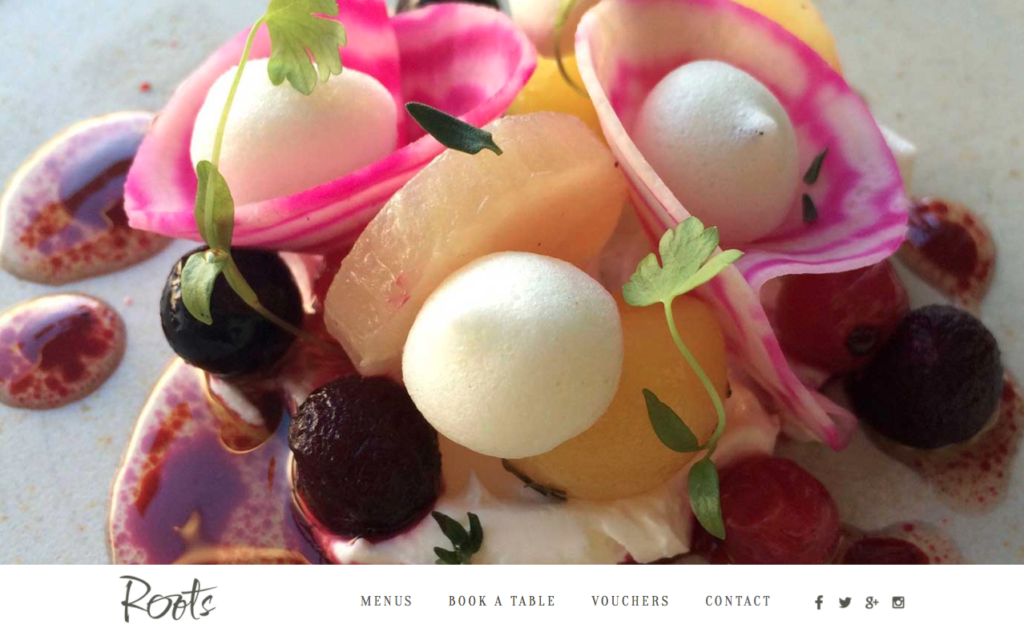
Why we love it: Everything you need in the first instance is on the home page – awards, tasting menus and more
80. Eat The Ordinary
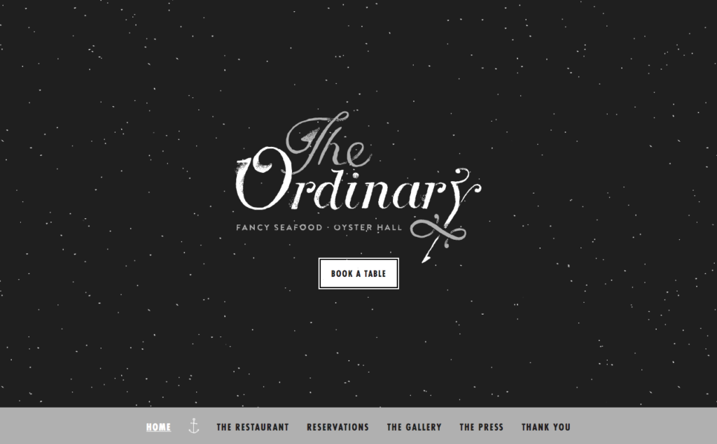
Why we love it: It is like viewing the most delightful starry night when you first land on the site
81. Quay
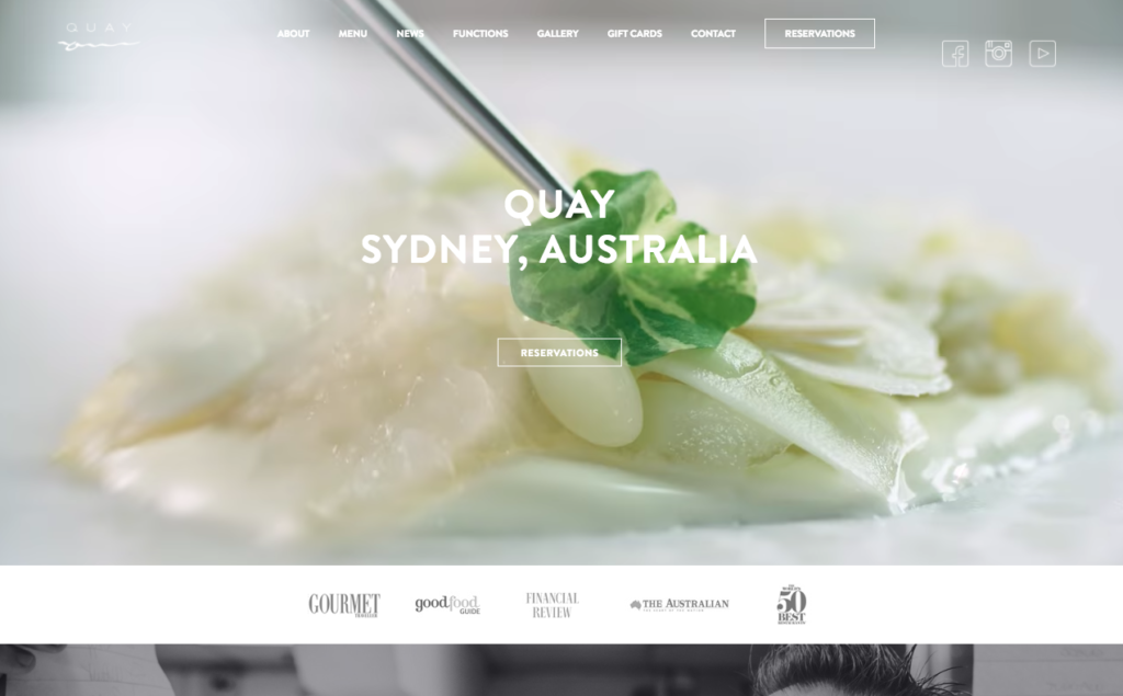
Why we love it: How you can reserve a table right from the home page and the great menu layouts
82. Rosebud Kitchen
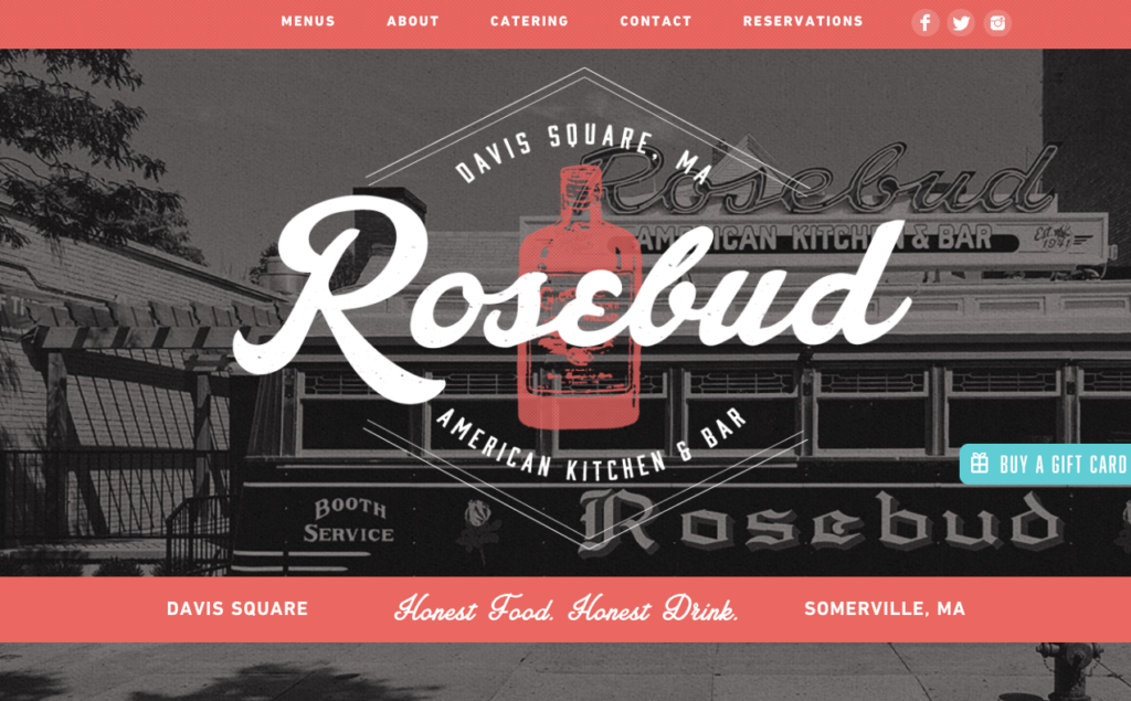
Why we love it: For its great colour palette
83. Junction Moama
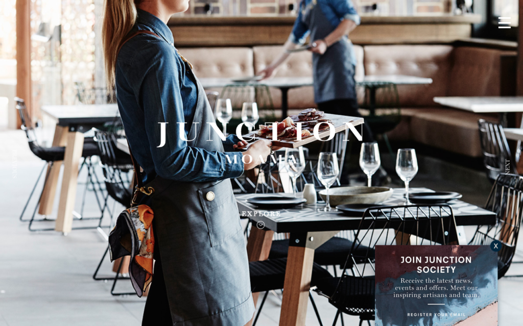
Why we love it: The way it showcases its fantastically stylish features
84. Easy Bistro
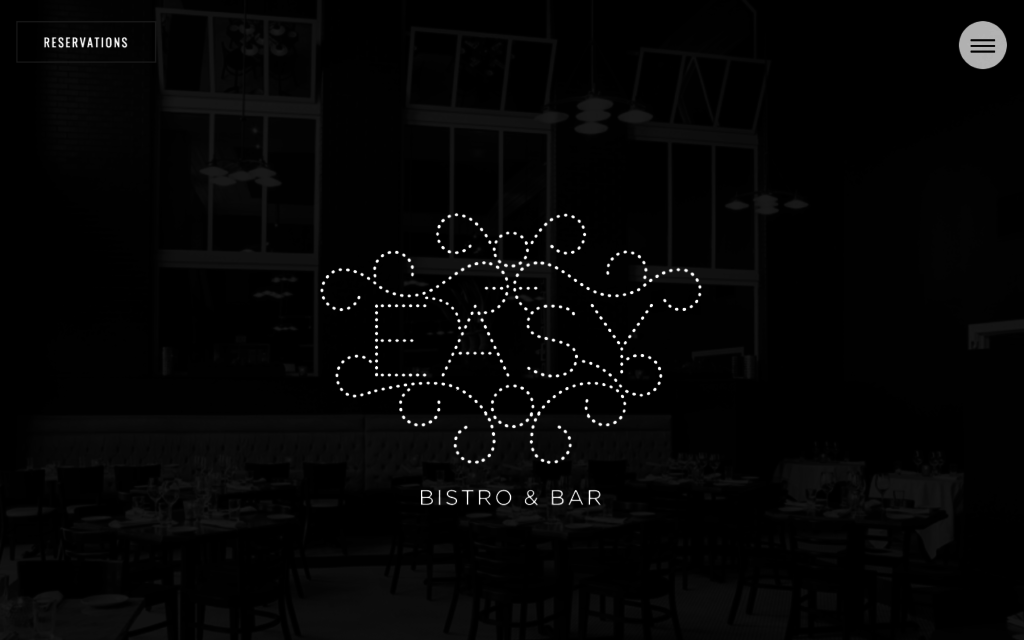
Why we love it: For its stylish aesthetics and easy-to-use reservations button
85. The Black Sparrow
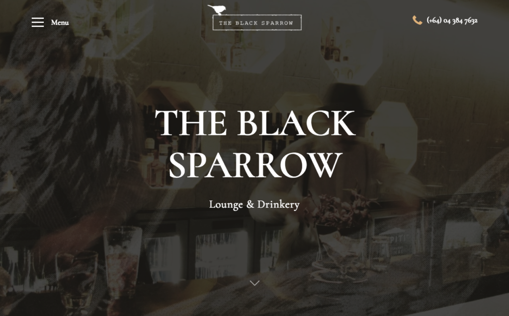
Why we love it: For its simple burger menu
86. Marianne Restaurant
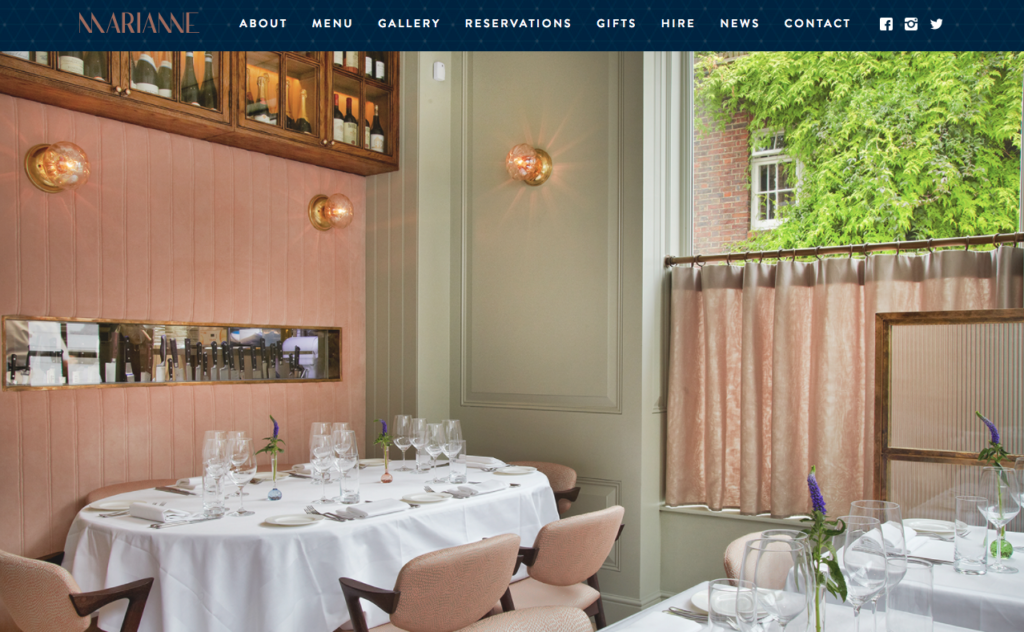
Why we love it: You can buy gift certificates for Marianne’s restaurant
87. Gaucho Restaurants
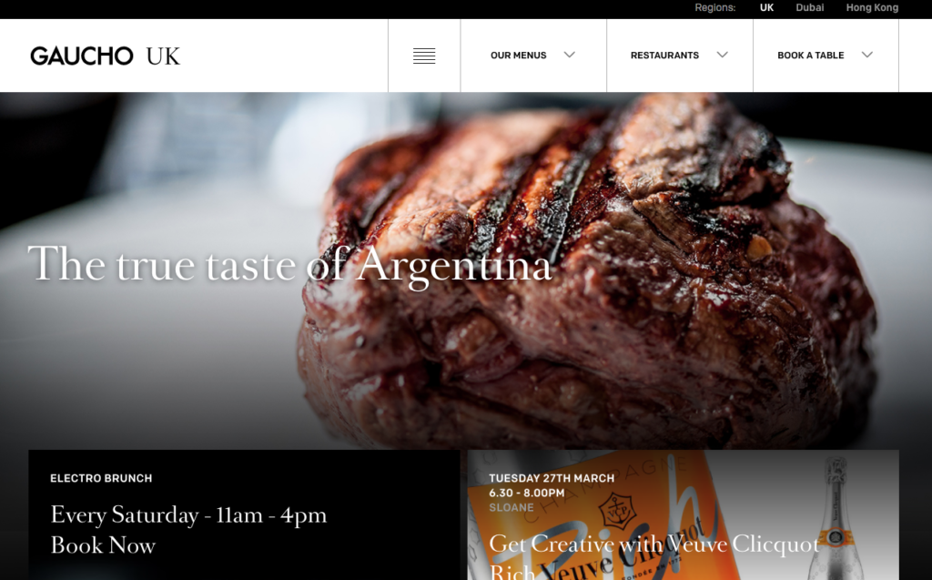
Why we love it: For its simple menu/navigation
88. Arbor Restaurant
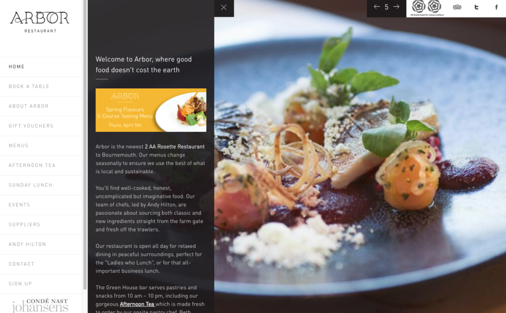
Why we love it: It effortlessly demonstrates its eco-friendly values whilst showcasing its first-class cuisine
89. Matchaya
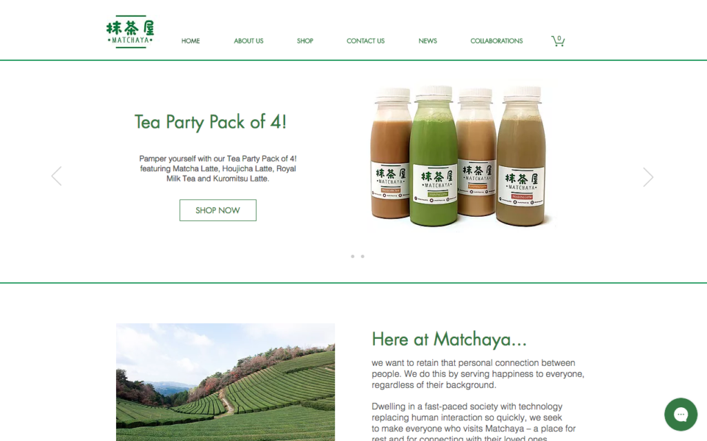
Why we love it: The background colours are very representative of what they sell
(NOTE: Matchaya uses CandyBar to run its loyalty program!)
90. Restaurante Baobab
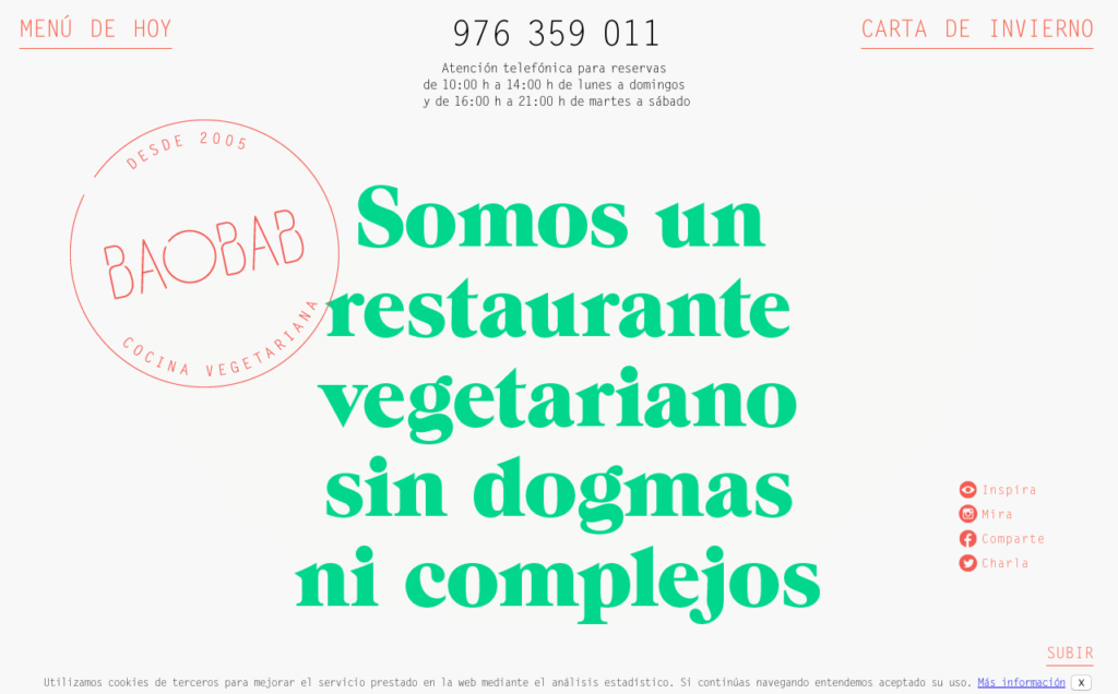
Why we love it: For its quirky sensibilities
91. Common Man Coffee Roasters
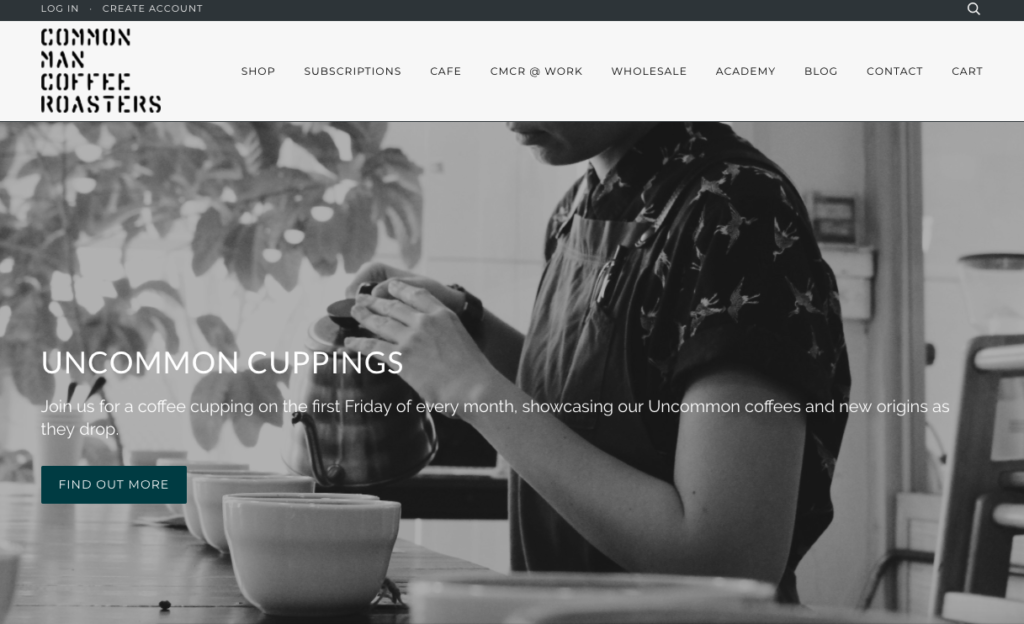
Why we love it: The black and white, minimalistic background
92. Mercer Tavern
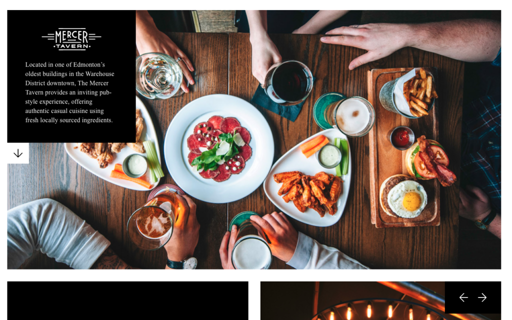
Why we love it: How it uses such rich and colourful imagery
93. Joes
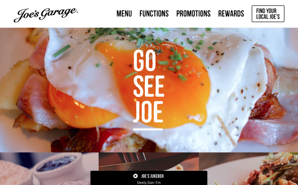
Why we love it: For its fun use of video and quirky features like Joe’s Jukebox
94. Whitmans
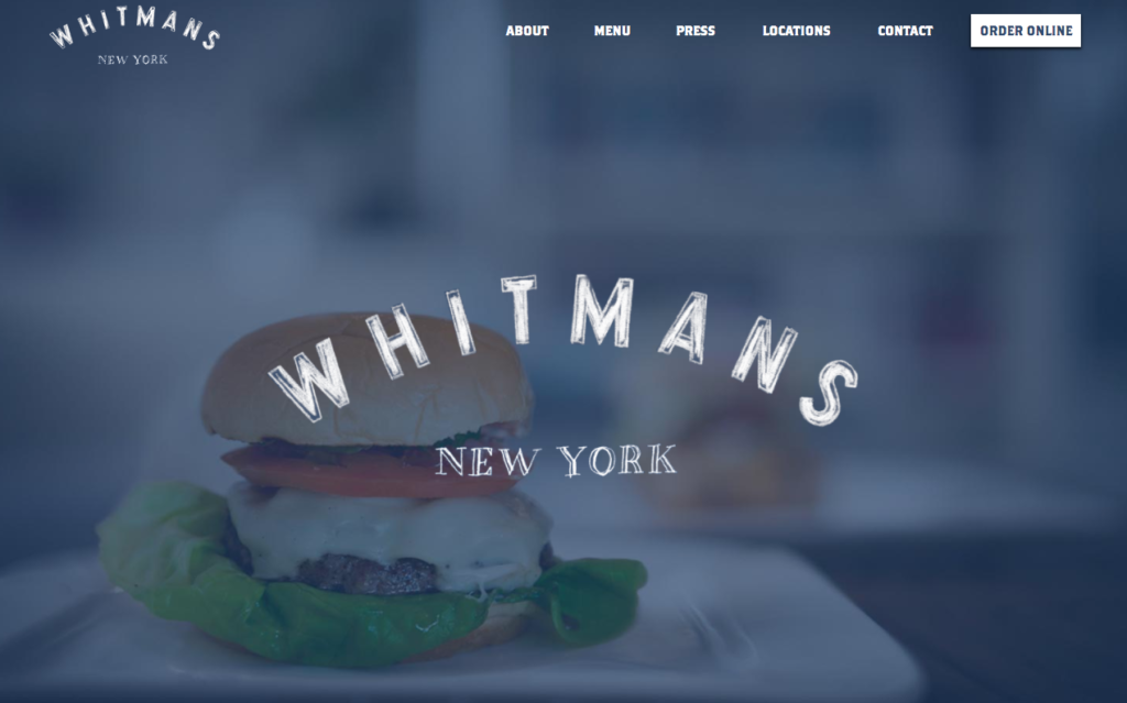
Why we love it: For its unusual menu buttons
95. The Bancroft
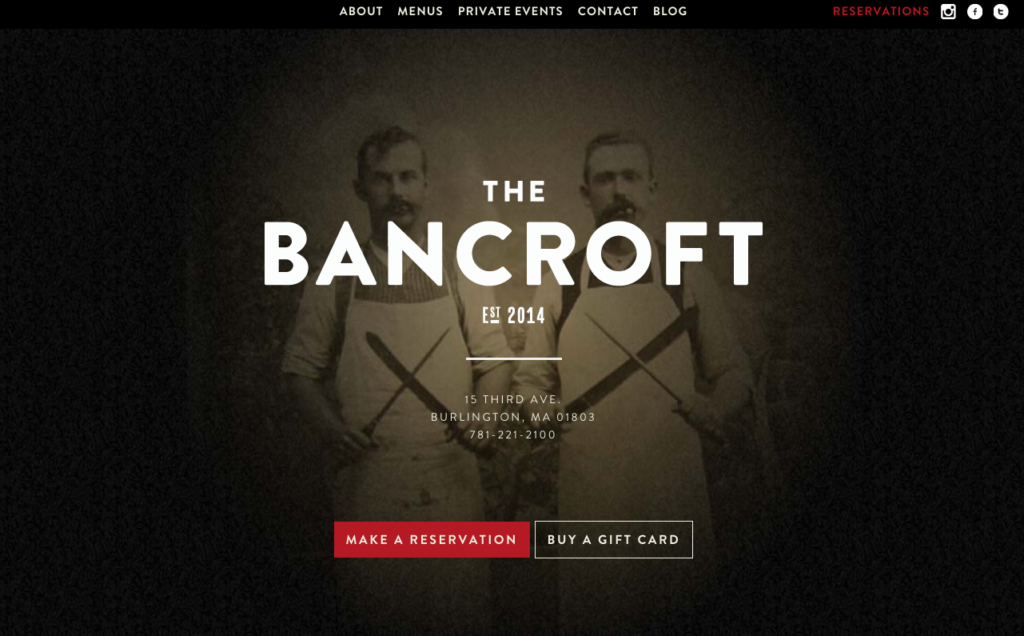
Why we love it: The way it showcases the restaurants nod to heritage
96. Brindisa Kitchens
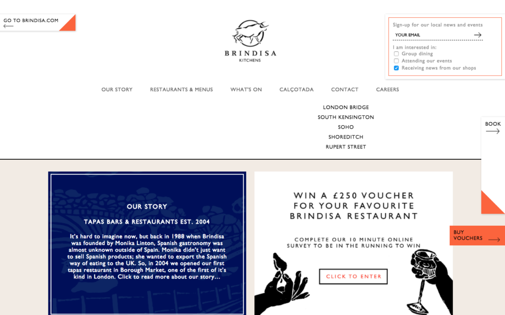
Why we love it: It hits you with a special prize draw as soon as you hit the site
97. Pitch Cardiff
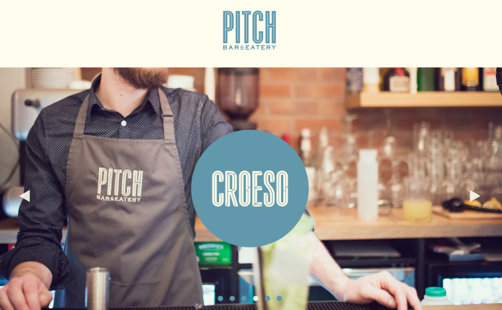
Why we love it: It manages expectations, encouraging people to book in advance with their handy booking tool
98. Cow and Co. Cafe
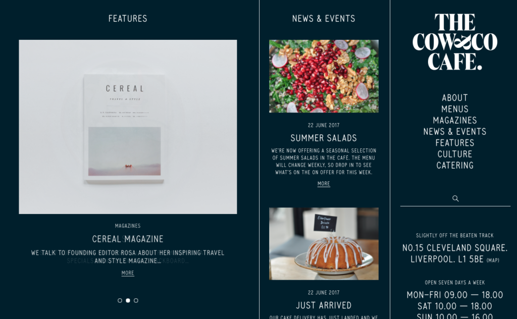
Why we love it: The way it uses its mailing list to capture data
99. The King Arms London
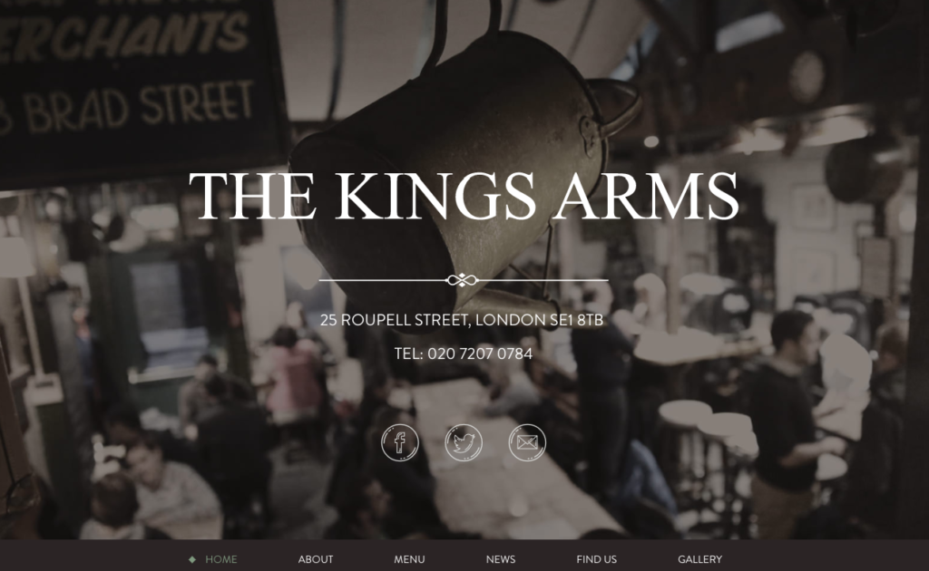
Why we love it: For its unusual menu layout that isn’t typically laid out to the top of the webpage
100. Cafe Monocle
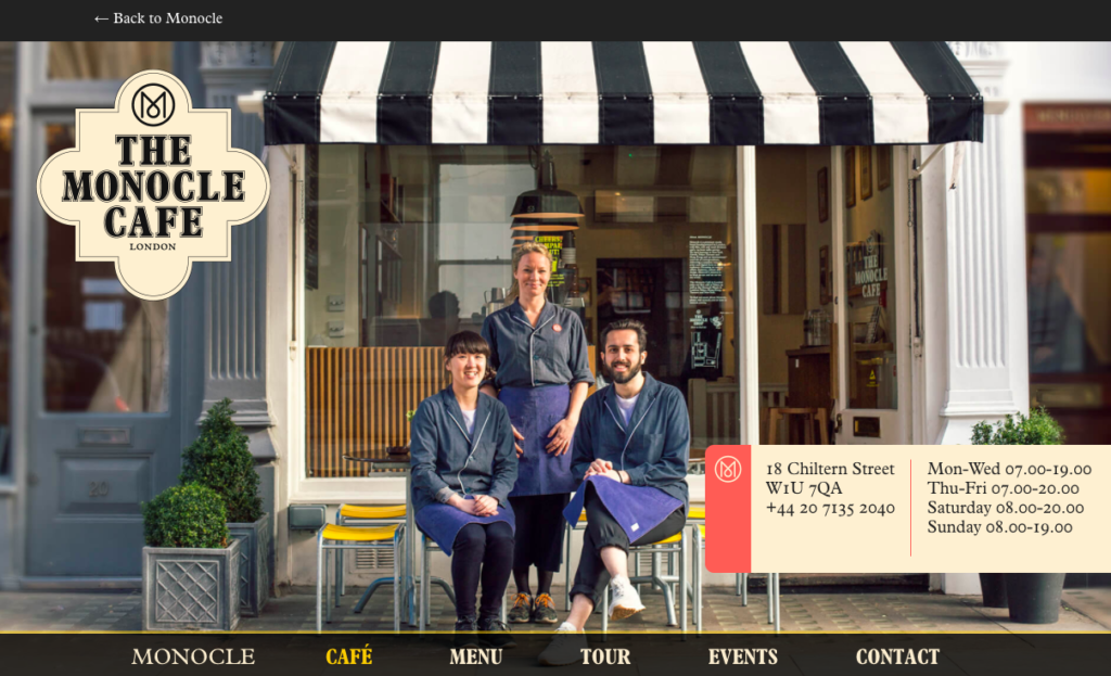
Why we love it: Its emphasis on its unique selling points
101. The Paper Mill
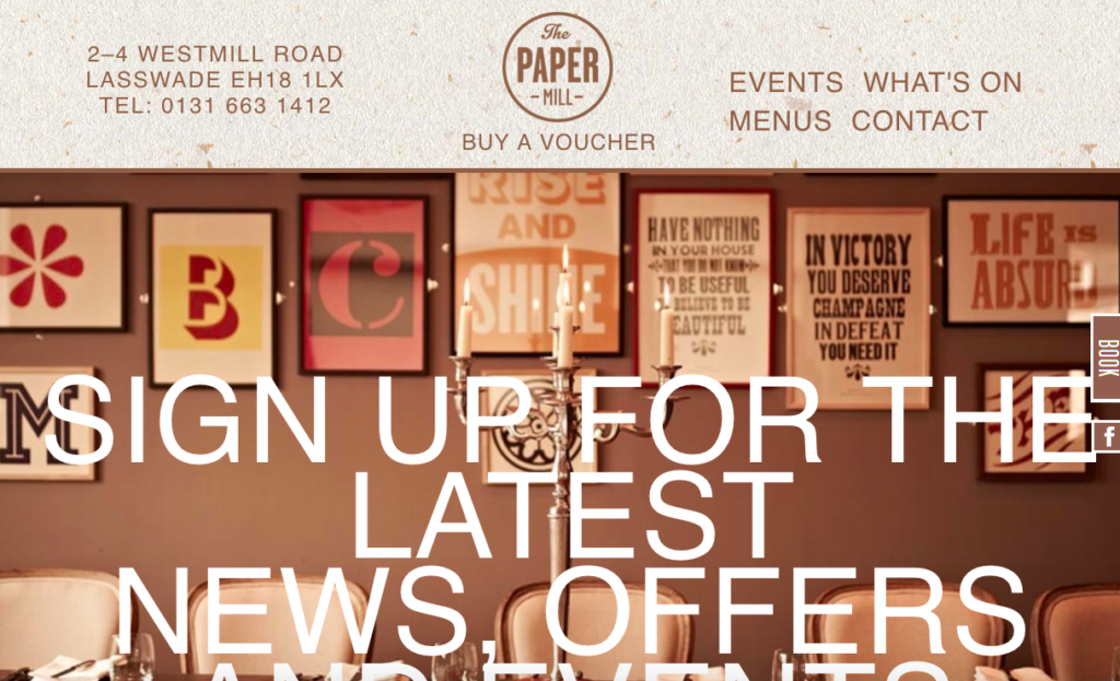
Why we love it: The way it uses its carousel of imagery
102. Drury Buildings
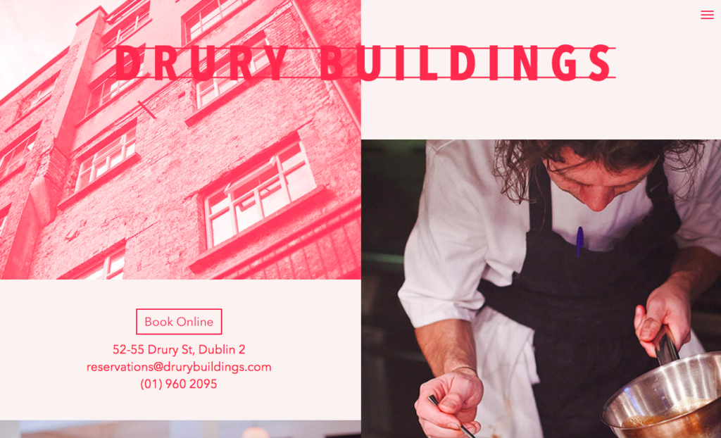
Why we love it: For showcasing both the exterior and the interior of this stylish restaurant
103. Nam Nam Noodle Bar
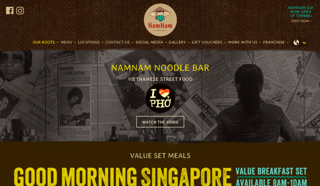
Why we love it: Very classic look that conveys the “authenticity” of their noodles
104. Colonia Verde
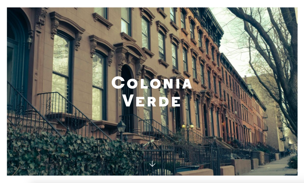
Why we love it: the way it utilises full-width imagery
105. Wired Cafe
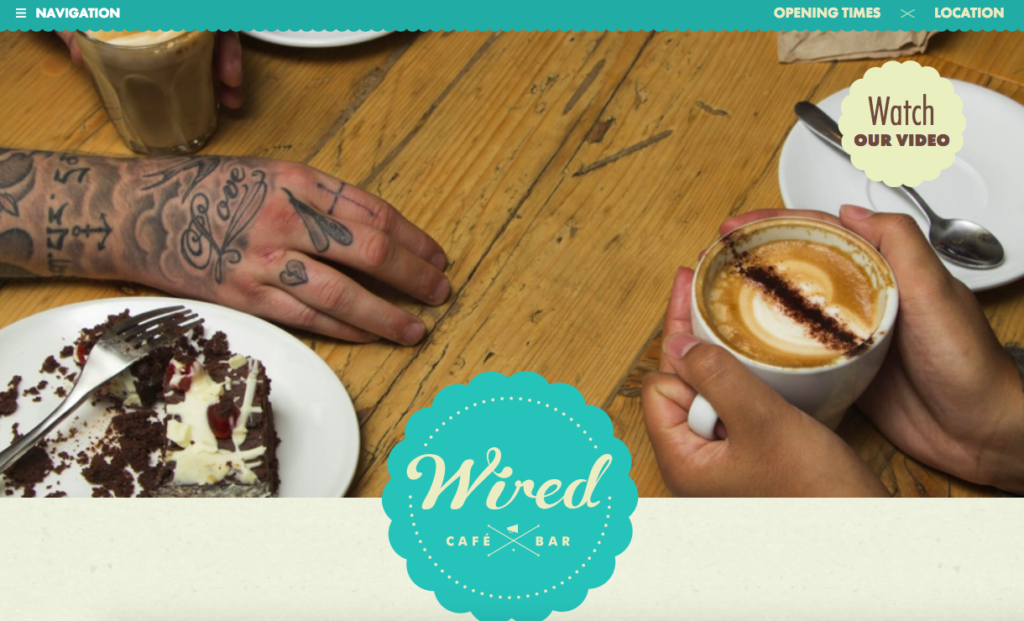
Why we love it: Its use of colour in the menu/top navigation bar
106. Bay Street Biergarten
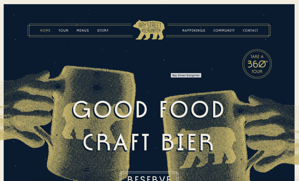
Why we love it: The way that you can take a 36- degree tour
107. Fifteen
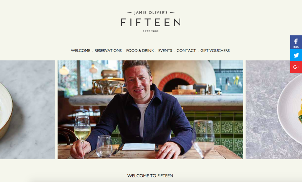
Why we love it: It’s simple but effective navigation
108. Lemonadela
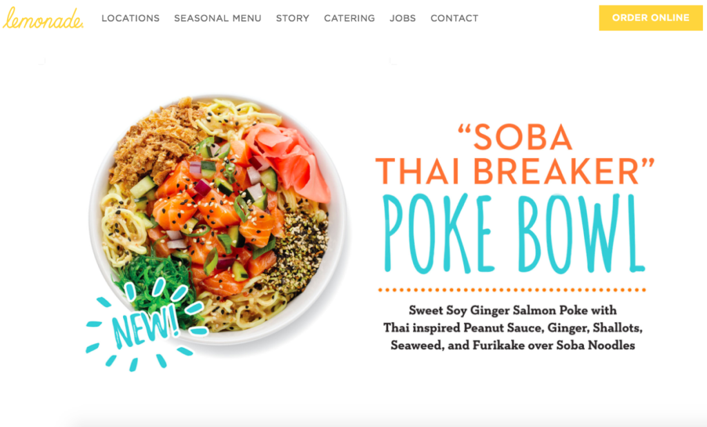
Why we love it: Its pretty yellow background with quirky detailing such as the ‘squeezing’ of information
109. Shizuku

Why we love it: for its simplicity
110. Ole Soiree
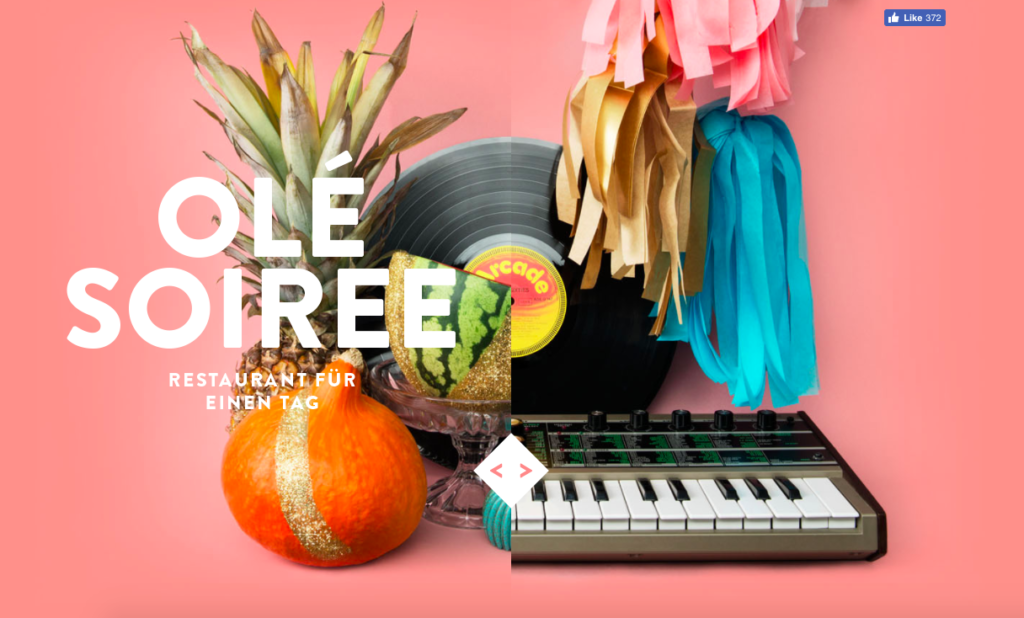
Why we love it: The way it uses quirky but fun imagery
111. Brae Restaurant
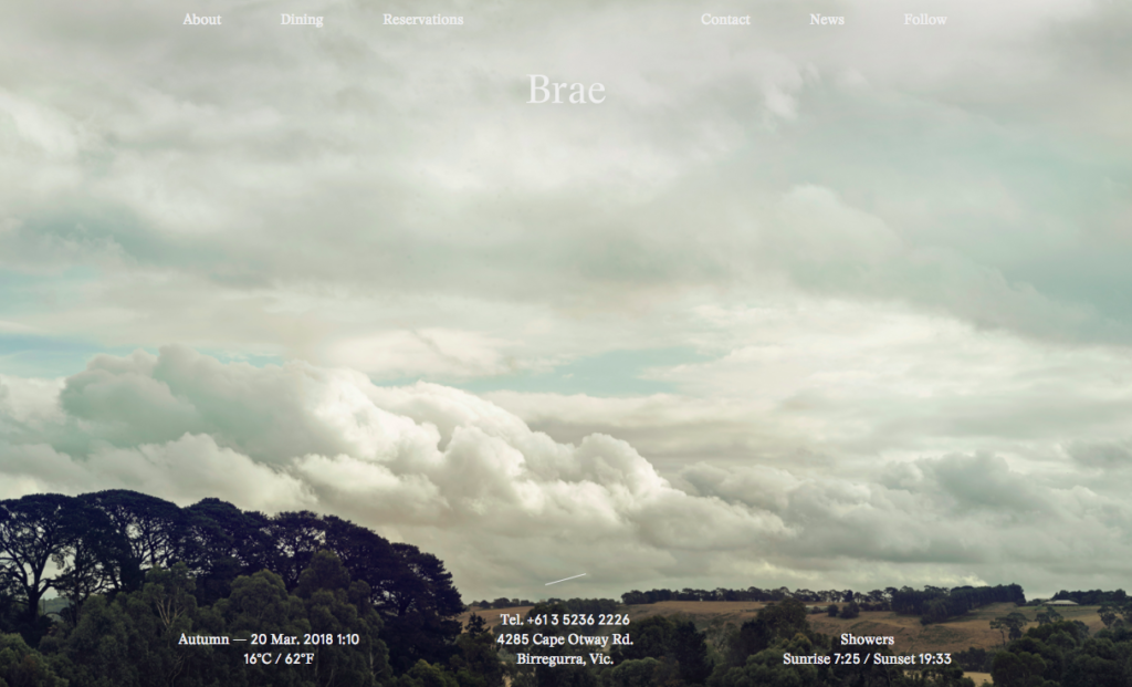
Why we love it: It utilises a simple but effective navigation
112. Cafe Sydney
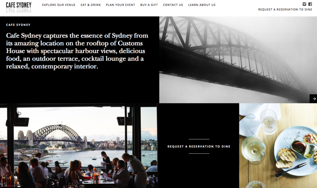
Why we love it: It really sets the scene of the magnificent location of this eatery
113. Benitos Hat
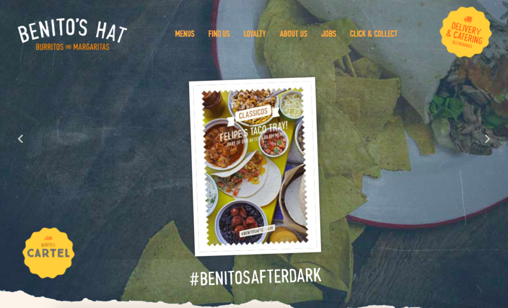
Why we love it: the way it promotes its loyalty reward scheme
114. Giraffe
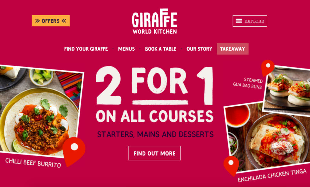
Why we love it: It highlights its exclusive offers prominently and uses strong colours
115. Jubany
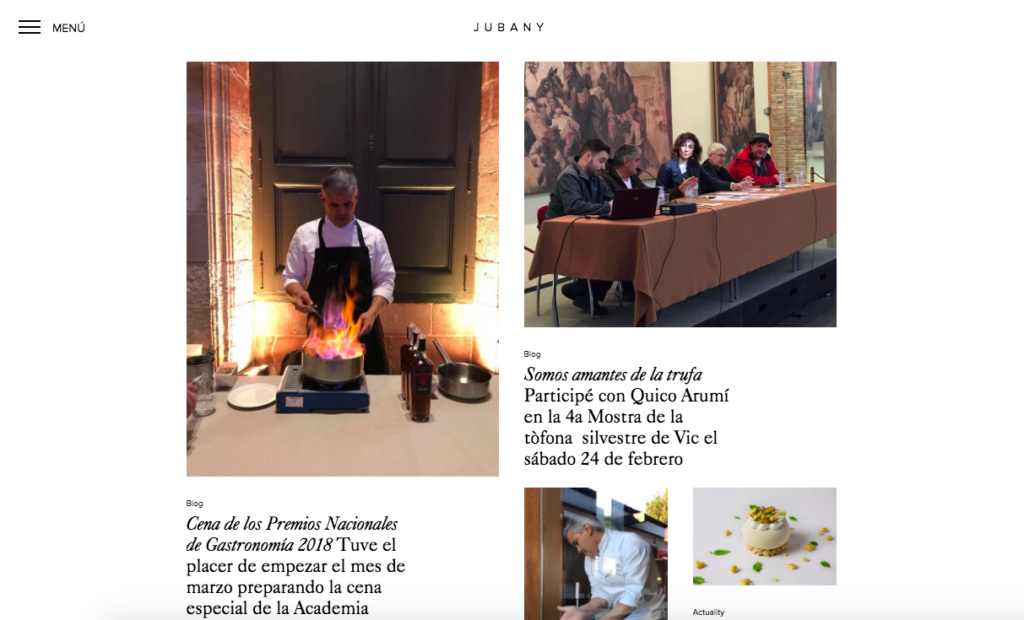
Why we love it: the way it evokes the senses with compelling text and imagery
116. Big Apple Hotdogs
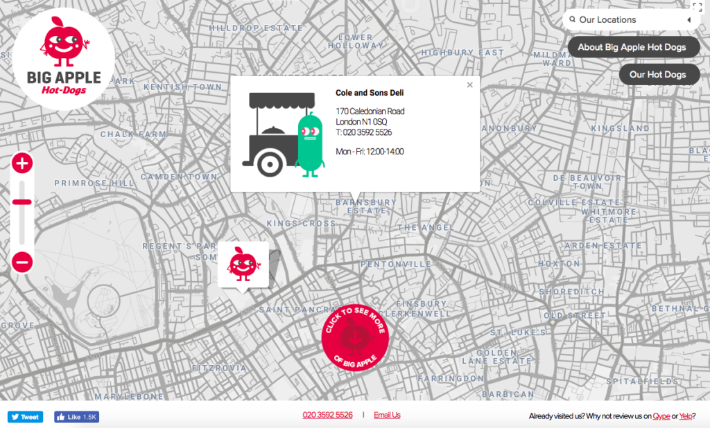
Why we love it: Its use of the grid of the city and how it encourages you to review the eatery
117. Ruby Violet
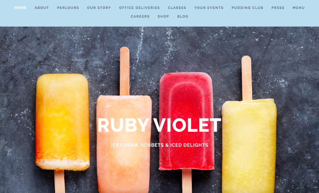
Why we love it: Its stunning use of colour which blends effortlessly with the food imagery
118. River Cottage
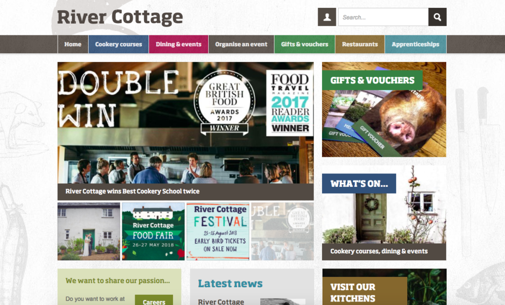
Why we love it: The way it lays out the different user journeys
119. Royal Plate
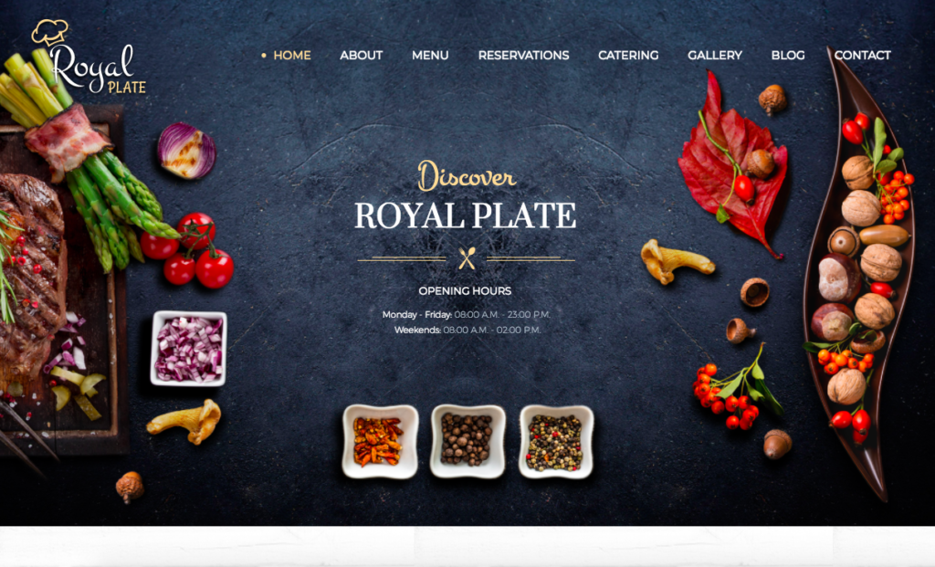
Why we love it: Its fantastic use of its Instagram dish reel and its ‘moving’ food images
120. Rosas Thai Cafe
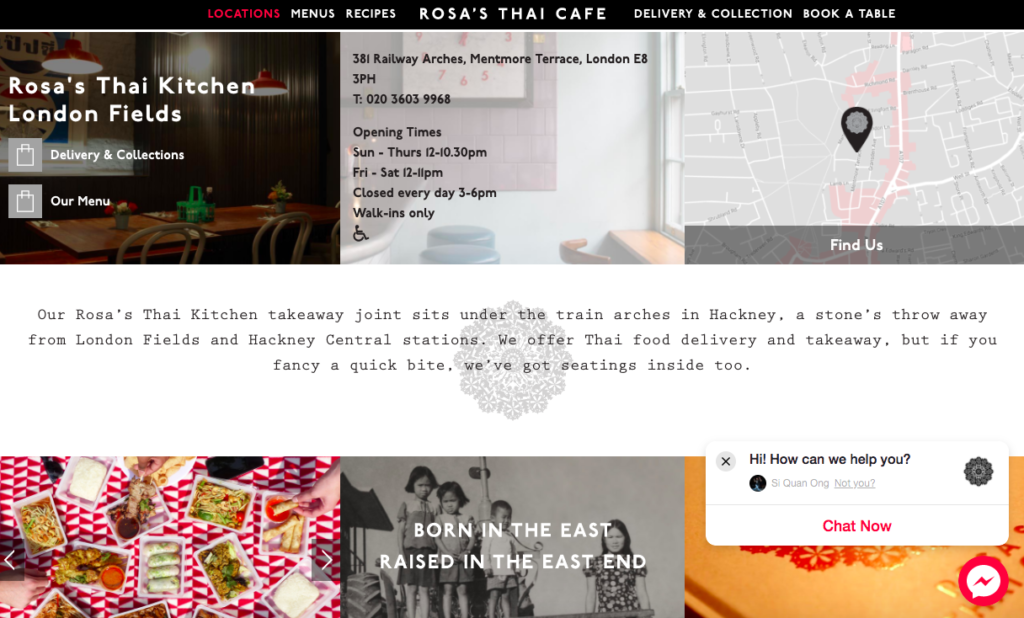
Why we love it: Its use of retro typography
121. Ilbuco Ristorante
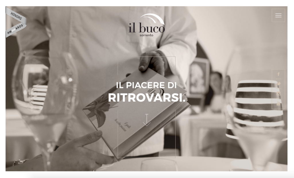
Why we love it: For its fantastic use of both horizontal and vertical scrolling and its stylish aesthetics
122. Marche Notre Dame
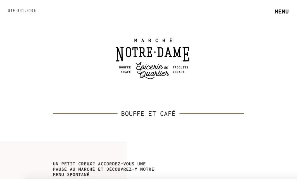
Why we love it: the way it resembles a vintage café chalkboard
123. Wafuken
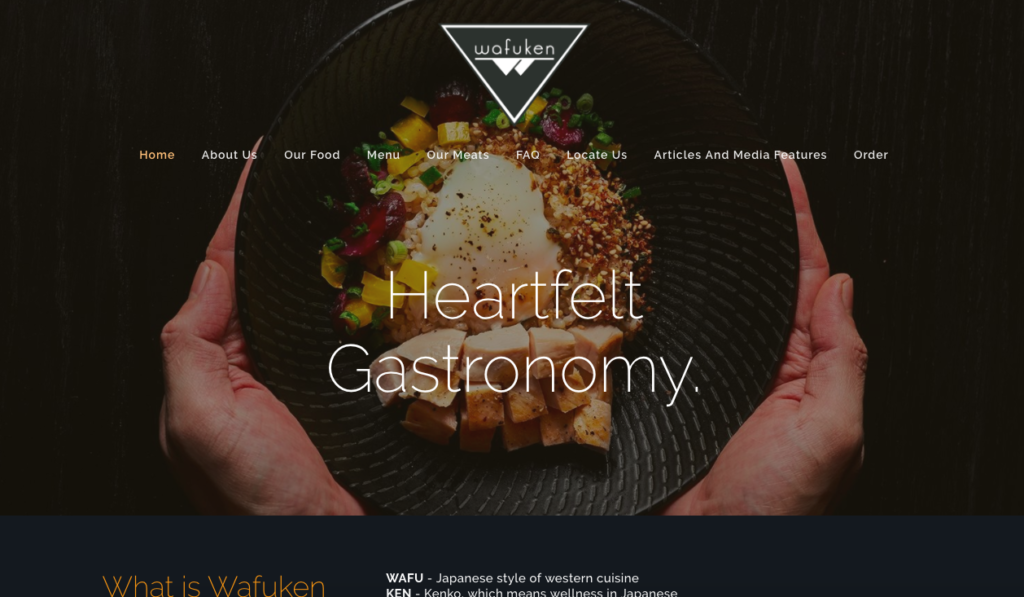
Why we love it: The beautiful central image that showcases its food
124. Tio Luchin
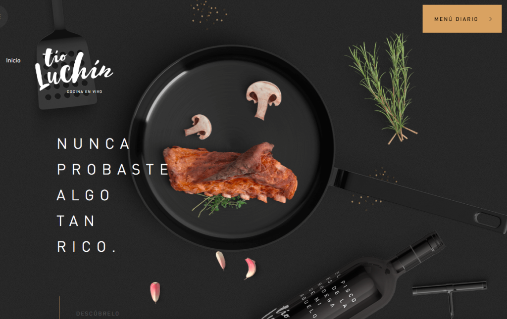
Why we love it: For using an opaque dark background to best demonstrate the ingredients and final plated dishes
125. Moxhe
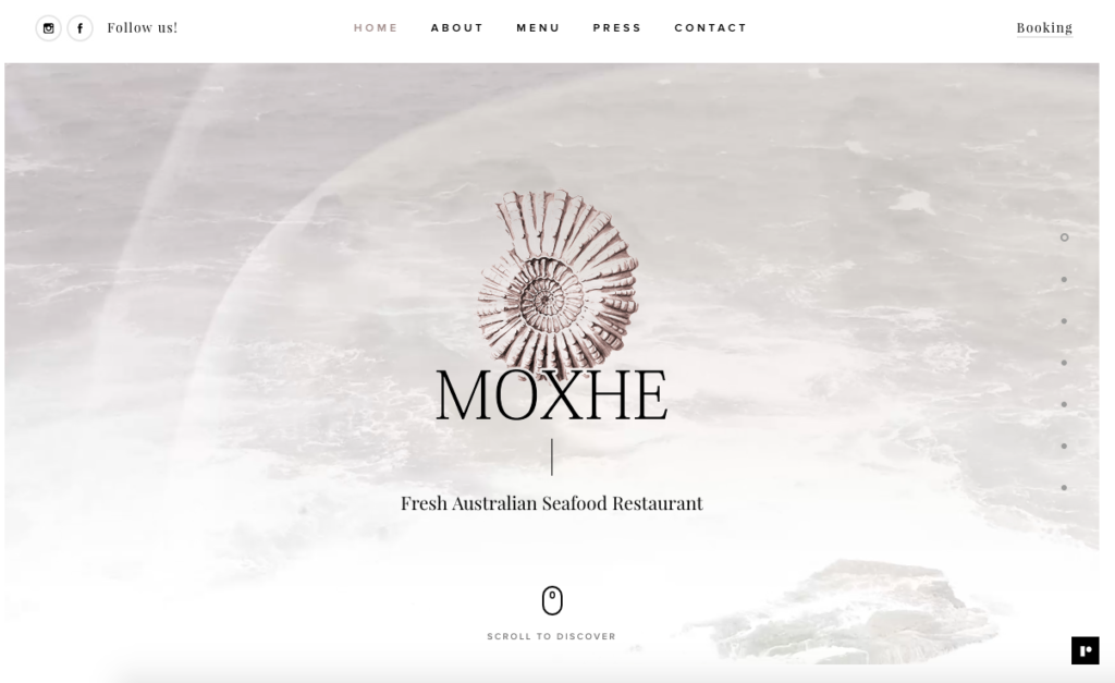
Why we love it: The way it uses looped visual imagery that really sets the tone of the restaurant
126. A Poke Theory
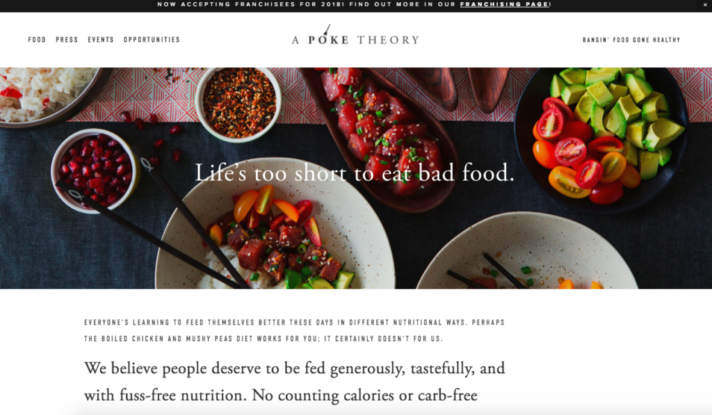
Why we love it: Love the slogan
(NOTE: Read the story behind A Poke Theory here.)
127. Crudo
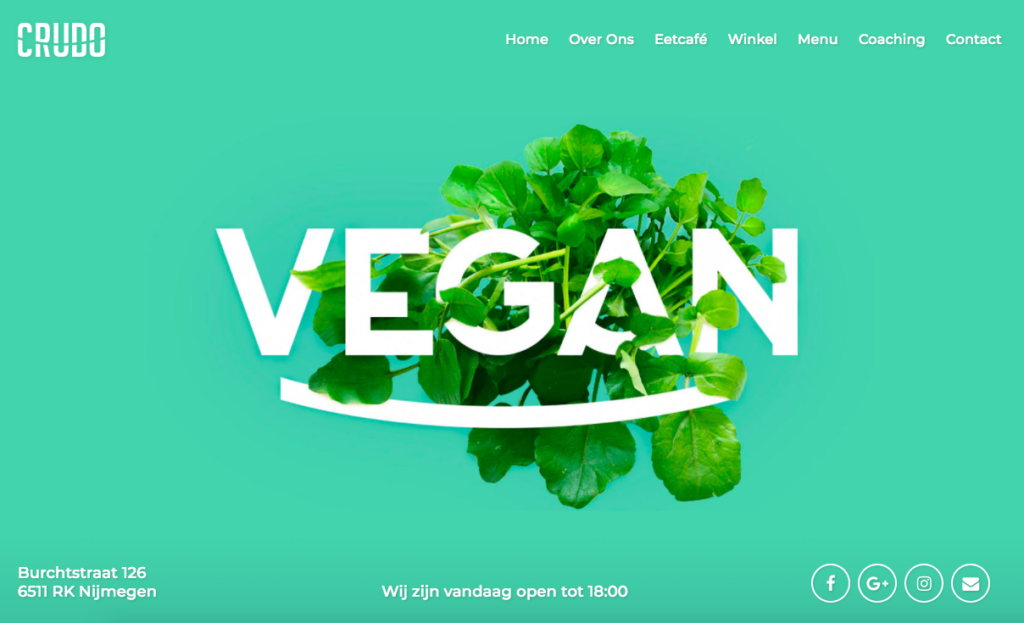
Why we love it: The way it uses ever-changing backgrounds and its fabulous use of colour
128. Baltazar Istanbul
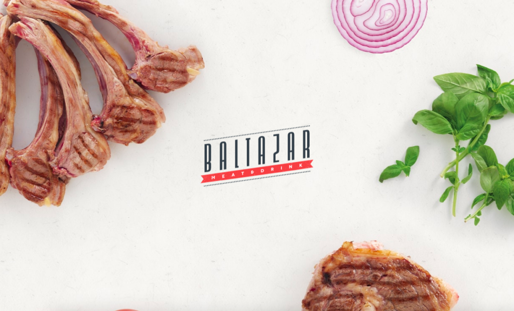
Why we love it: Subtle but stylish nods to design such as the mouse cursor changing when you click and the way it utilises its exclusive offers on the home page
129. D’Good Cafe
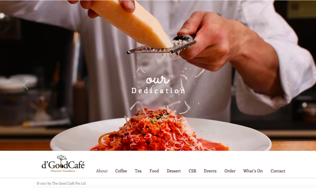
Why we love it: The way they put their dishes right and center.
(NOTE: Read the story behind D’Good Cafe here.)
130. Green Rebel
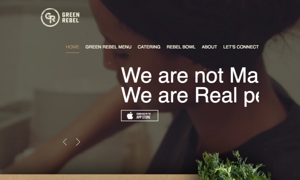
Why we love it: The unfolding menu options are a neat touch
131. Shukuu Izakaya
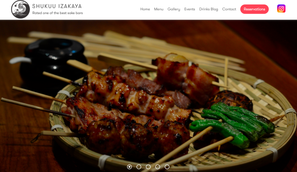
Why we love it: Those delicious skewers!
(NOTE: Read the story behind Shukuu Izakaya here.)
132. Pizzeria Napoli Centrale
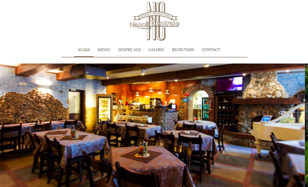
Why we love it: For its easily accessible menu and other supporting information
133. Le Mugs
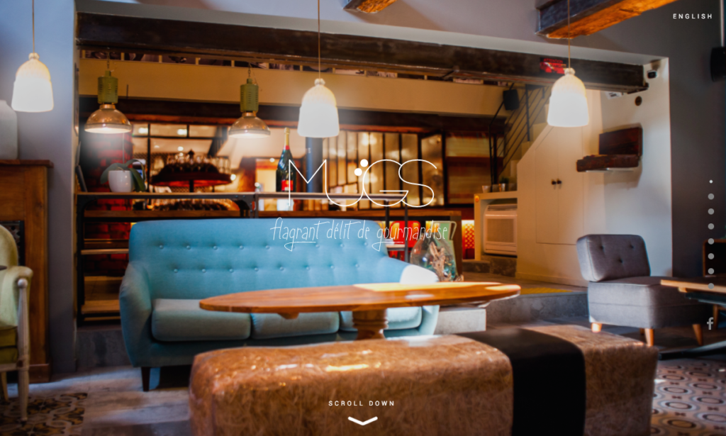
Why we love it: For its significant use of imagery and muted colours
134. Giuliano Restaurant
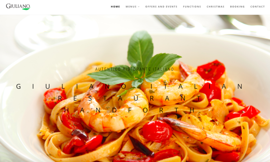
Why we love it: for its compelling copy about the heritage of the restaurant and the people behind it
135. Astrid y Gaston
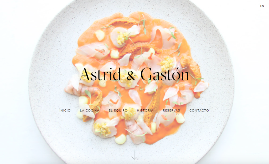
Why we love it: the way it uses rich imagery of colourful dishes
136. Ele
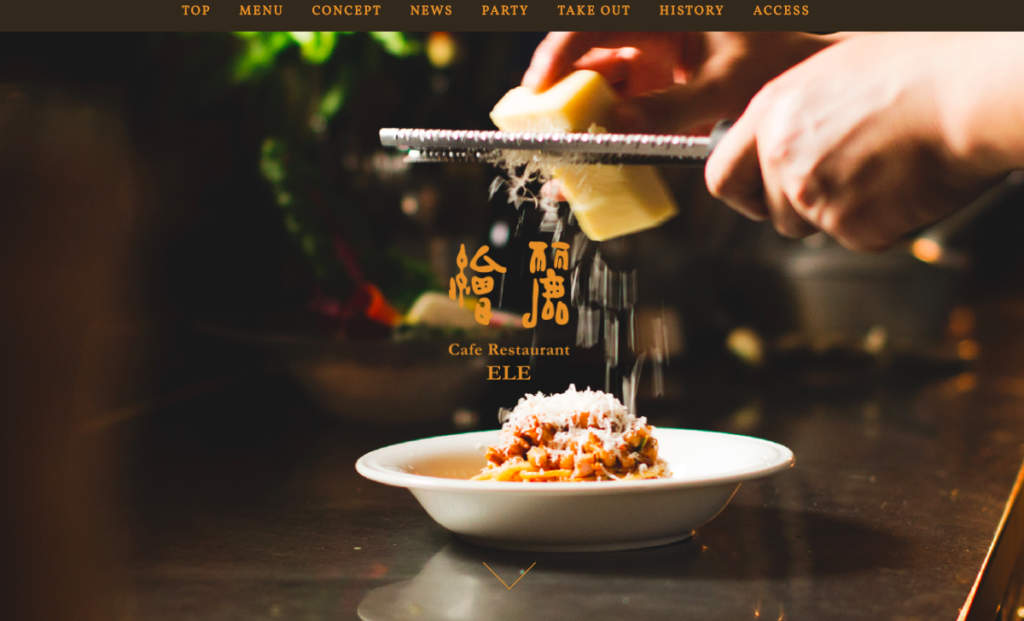
Why we love it: The way it uses photos of the chefs in action
137. Sophie’s Steakhouse
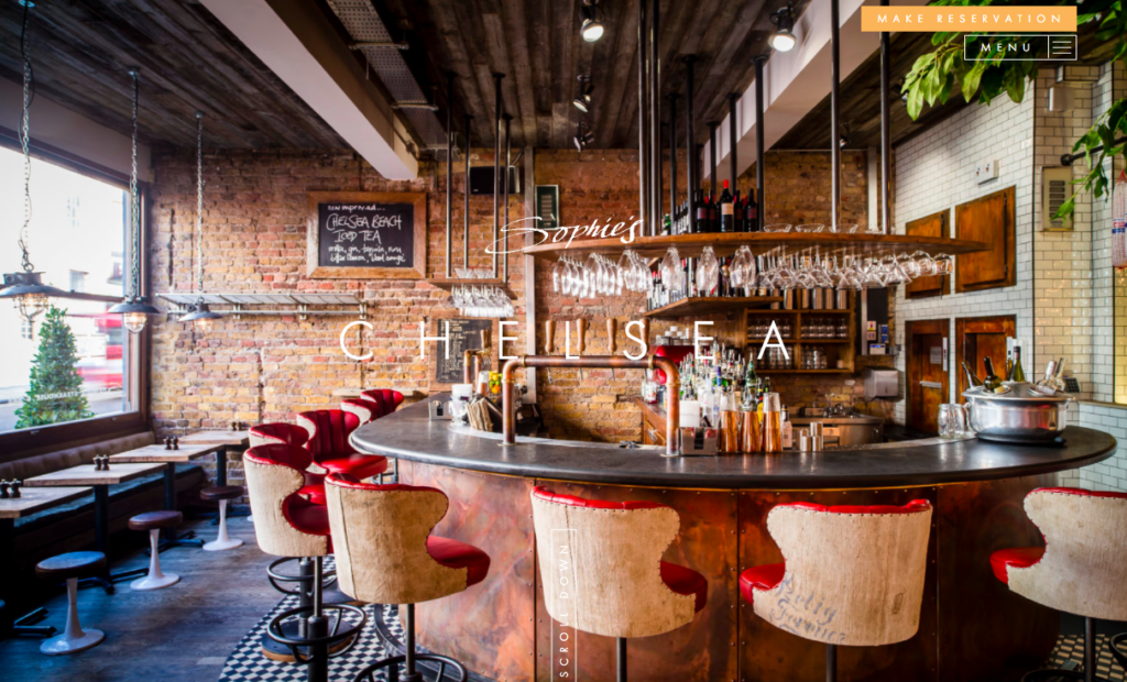
Why we love it: Its moving images gives this site a truly modern feel
138. Rosewater
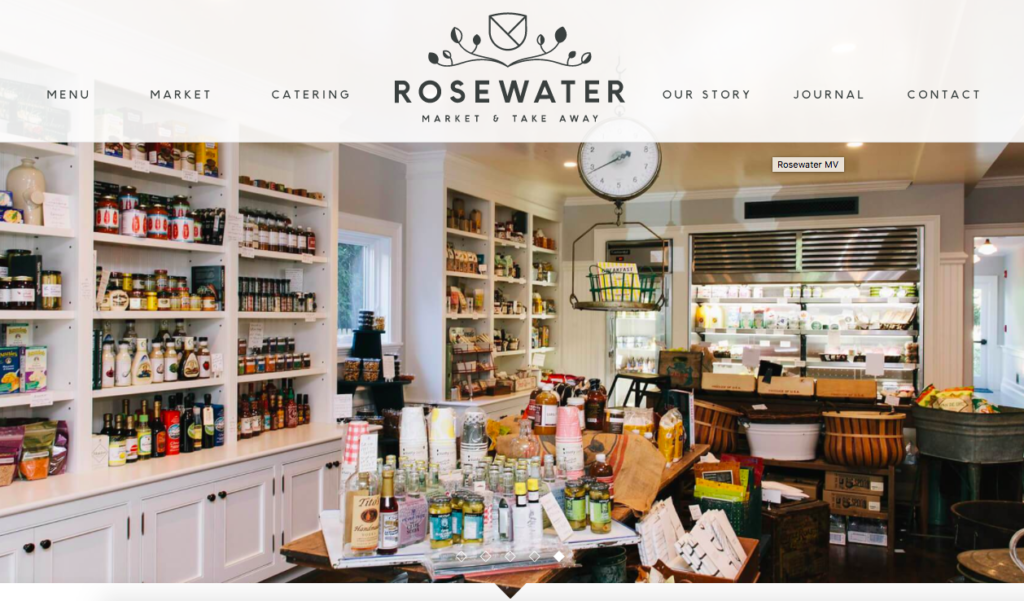
Why we love it: This site uses simple but familiar vintage styling giving it a lovely throwback vibe that is filled with nostalgia
139. Blackhouse
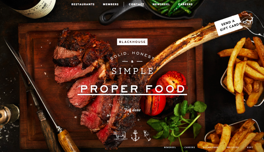
Why we love it: For using innovative functionality such as ‘send a gift card’
140. Indis
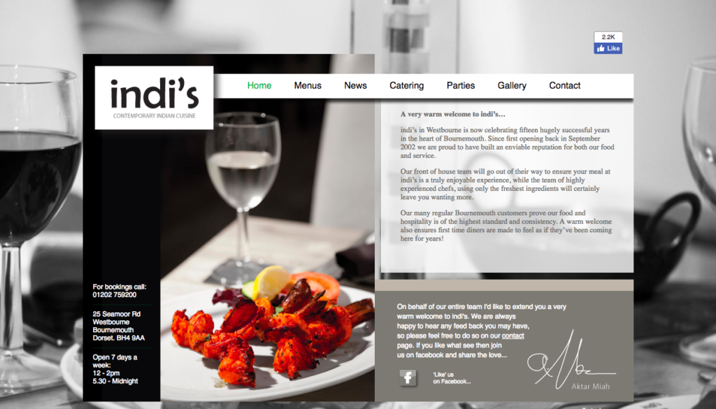
Why we love it: It uses a gallery function to showcase more of their dishes
141. El Burro
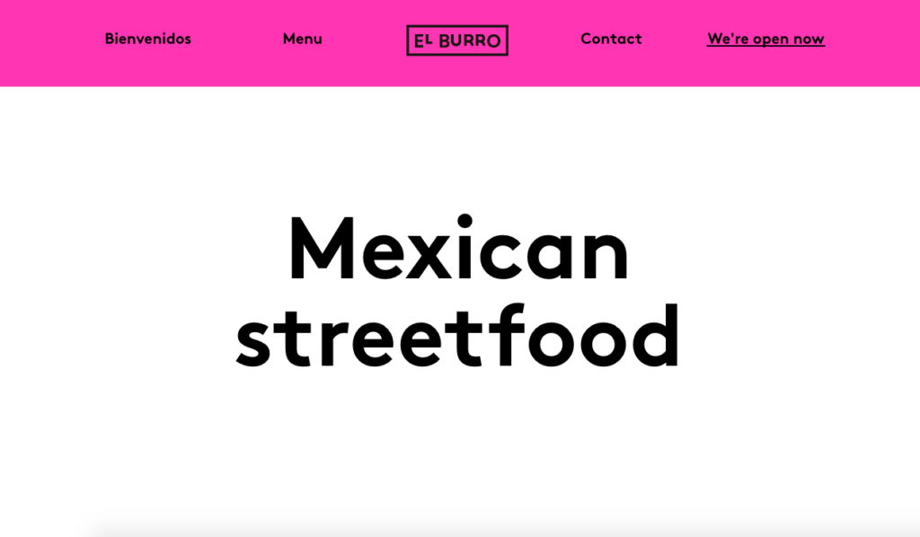
Why we love it: It showcases the restaurants branding perfectly from the moment you land on the site and are greeted by a little cactus plant
142. Gourmet Natural Restaurant
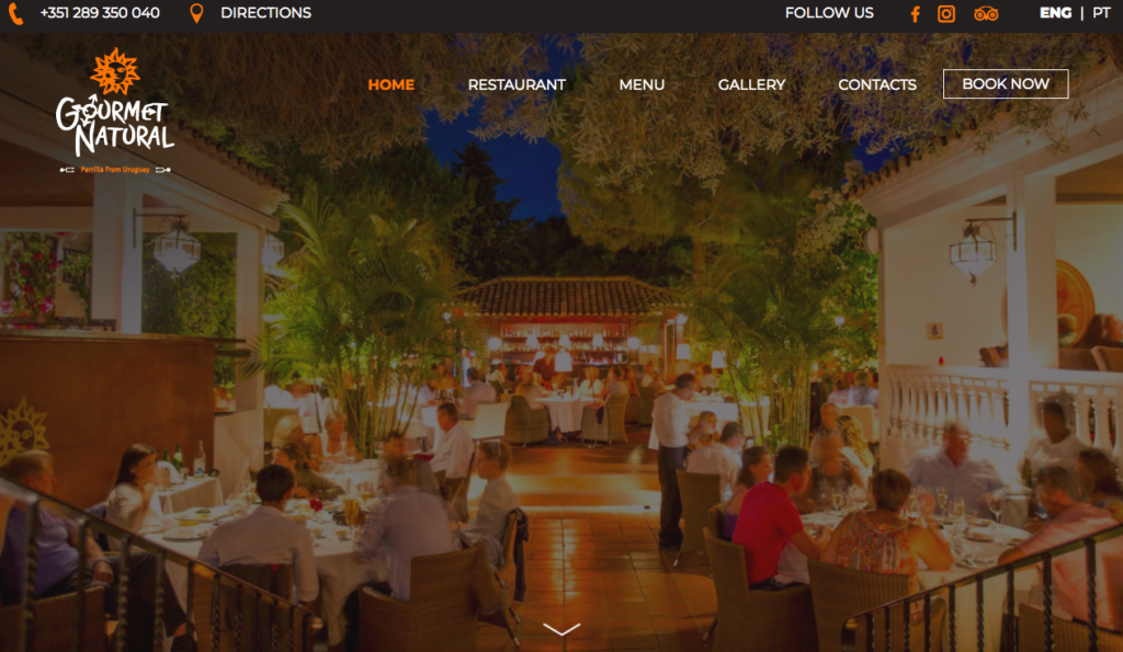
Why we love it: It shows the dining area on a bright sunny day and highlights that this is available to use all-year around
143. Provenance Raleigh
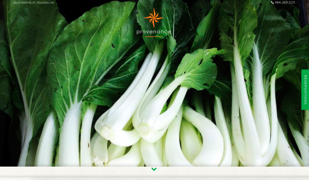
Why we love it: It really sets the tone of what this restaurant is trying to achieve with effective copy and striking imagery
144. La Marcha
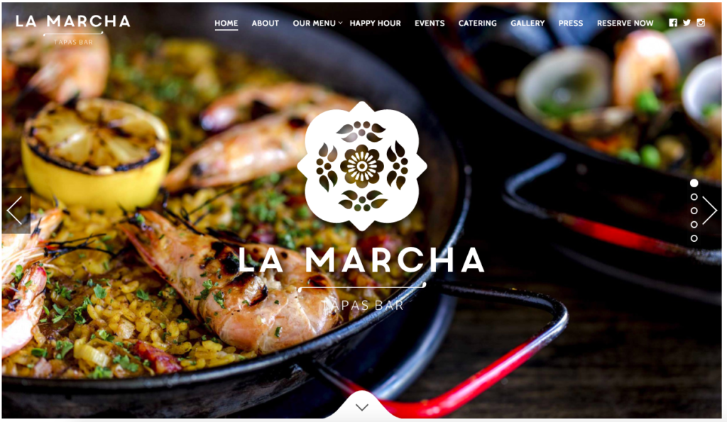
Why we love it: Its superb use of imagery will have you licking your lips in anticipation of the food that is presented
145. Paddock
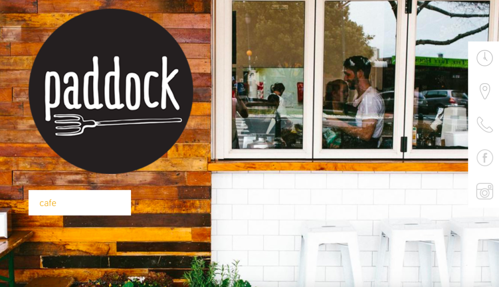
Why we love it: for not being afraid to go super-simple in design and to use bold call to actions
146. Block 16
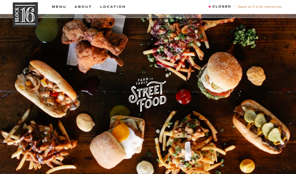
Why we love it: Another simple site but it is not afraid to tell the story of the ethos of the restaurant
147. Pineapple and Pearls
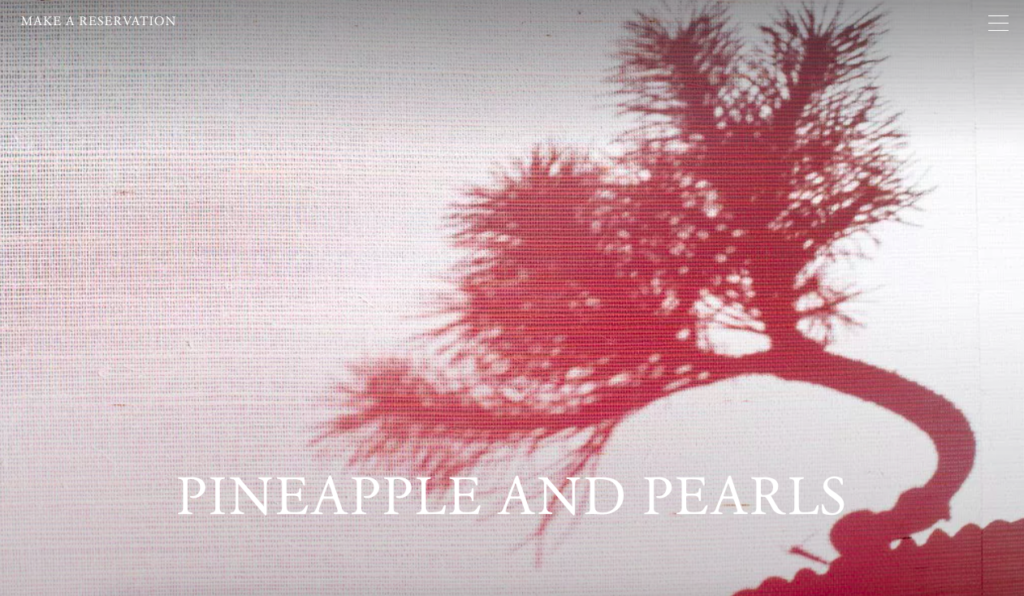
Why we love it: It looks equally as stylish on a tablet and mobile as it does on a widescreen desktop
148. Zadie’s Oyster Room
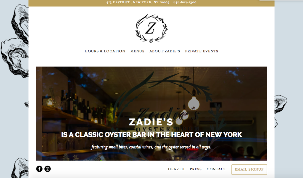
Why we love it: For its use of subtle gold detailing and its oyster background
149. Quince Restaurant
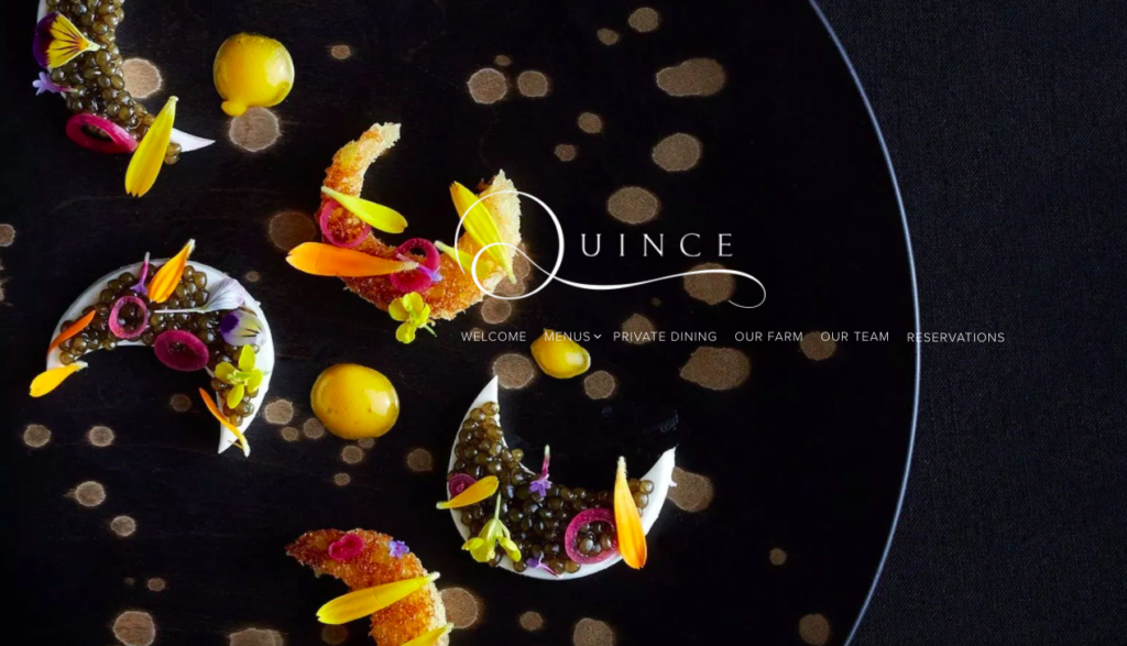
Why we love it: This site fuses dark charcoal backgrounds with pops of colour which really makes their dishes standout
150. Eleven Madison Park
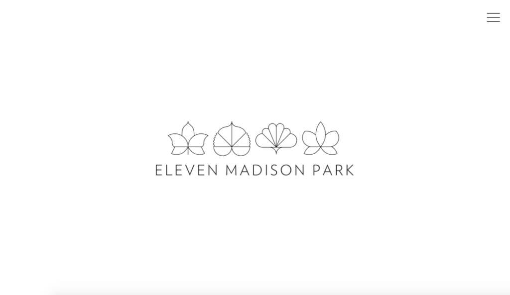
Why we love it: For not being afraid of white space, at first glance this looks like a one-page microsite, but the side menu is subtle but effective.
A winning restaurant website must represent your eateries’ dining experience, attract new customers, encourage existing customers to revisit, tell a story and showcase the heart and soul of your brand.
Therefore, it has never been more important to make sure that your website has that all important mix of ‘ingredients’ – stylish design, simple navigation alongside helpful and informative information.